
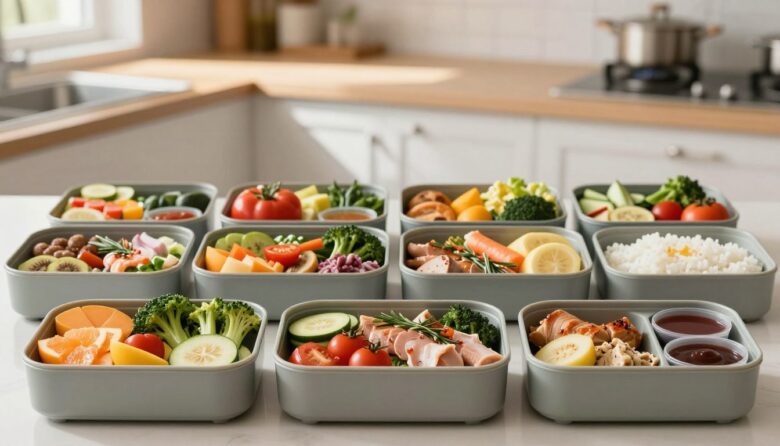
Bento grids can make complex pages easier to scan by separating related information into recognizable modules. They can also increase confusion when designers create too many decorative cards, change the reading order, or use size and color without a clear meaning. The layout only helps when its visual structure matches the user’s task.
A bento grid is an informal visual pattern, not a cognitive-load standard. Cognitive load theory was developed primarily in learning and instructional-design research. Its ideas can help interface teams discuss unnecessary interpretation effort, but a particular grid shape does not scientifically guarantee faster comprehension, higher engagement, or better conversion.
What designers mean by a bento grid
A bento grid is a modular layout made from cards or panels of different sizes. A large module may present the primary message, while smaller modules contain supporting features, statistics, shortcuts, media, or status information.
The pattern differs from a uniform gallery because the modules do not all receive equal visual weight. That variation can help communicate hierarchy, but only when the larger areas contain genuinely more important or more complex content.
Chunking
Related information is placed inside a shared boundary so users do not need to infer every relationship from proximity alone.
Hierarchy
A limited number of module sizes distinguish primary, supporting, and optional content without making every card compete for attention.
Sequence
The visual path, document order, keyboard order, headings, and responsive layout preserve a coherent journey through the content.
How modular grouping can reduce unnecessary effort
A complex task contains difficulty that the interface cannot remove. A financial dashboard still contains numbers, a game inventory still contains equipment choices, and a hosting panel still contains technical settings.
Interface design can, however, avoid adding extra effort. Users should not have to decode unclear grouping, compare unrelated cards, search for hidden labels, or remember where a module moved after every screen change.
The structured version does not remove information automatically. It separates the main task from alerts, status, history, and shortcuts so each region has a clearer role.
When a bento layout is appropriate
Product or feature overviews
A large product story can be supported by smaller modules for specifications, compatibility, examples, media, and related benefits.
Dashboards and workspaces
Modules can group status, recent work, alerts, shortcuts, and trends when users need an overview before opening detailed views.
Game menus and inventories
Larger regions can hold the selected item or current objective, while smaller modules show resources, attributes, loadout, or contextual actions.
Sequential and text-heavy tasks
Forms, legal documents, setup instructions, articles, and checkout flows often benefit from a clear linear sequence rather than aggressive asymmetry.
Do not convert every paragraph into a card. Boundaries are useful only when they communicate a real relationship. Excessive containers create more edges, backgrounds, headings, and alignment decisions for users to interpret.
Plan the grid from content, not decoration
A low-confusion planning process
Determine what the page must communicate before drawing rectangles.
-
Create a content inventory
List every heading, metric, action, image, status, message, filter, and supporting detail. Remove repeated or low-value content before arranging the layout.
-
Group information by user question
Each module should answer a recognizable question such as “What needs attention?”, “What changed?”, “What can I do next?”, or “Where can I find more detail?”
-
Assign priority from task importance
Classify modules as primary, supporting, or on demand. Do not make a card large merely because it contains an attractive illustration.
-
Write headings before styling
A concise heading should identify the module without requiring users to inspect its icon, color, or position. Proper heading markup also preserves structure outside the visual presentation.
-
Establish a logical source order
Write the HTML in the order people should read and operate it. CSS may change the visual arrangement, but the underlying sequence must still make sense when styles are removed or the layout becomes one column.
-
Apply a small sizing system
Use a limited set of spans, such as full, two-thirds, half, and one-third. Too many arbitrary sizes make alignment difficult and weaken the hierarchy.
-
Prototype with realistic content
Include long translations, maximum values, missing images, error messages, loading states, empty states, and enlarged text. Placeholder text hides many layout failures.
Build hierarchy with more than card size
| Design signal | Useful role | Common failure | Better practice |
|---|---|---|---|
| Module size | Indicate importance or provide space for complex content | Making decorative media larger than the main task | Connect size to user priority and content requirements |
| Position | Place high-priority information early in the reading sequence | Assuming the top-left card is perceived first in every language and layout | Combine position with headings, size, and logical document order |
| Color | Distinguish status, category, or emphasis | Giving every card a saturated background | Use restrained surfaces and reserve strong color for meaningful states |
| Typography | Clarify titles, values, supporting text, and actions | Using several oversized labels that compete equally | Define a repeatable type hierarchy across every module |
| Spacing | Show which elements belong together | Using identical gaps inside and between unrelated groups | Keep internal relationships tighter than separation between modules |
| Interaction | Make actionable regions understandable | Turning the entire card into an unlabeled link | Use specific link or button labels and visible focus states |
A responsive CSS Grid foundation
CSS Grid is well suited to two-dimensional card arrangements. A twelve-column system gives designers flexibility while keeping spans predictable. The example below preserves the HTML source order and changes only the presentation.
.bento-grid {
  display: grid;
  grid-template-columns: repeat(12, minmax(0, 1fr));
  grid-auto-rows: minmax(9rem, auto);
  gap: 1rem;
}

.bento-card {
  grid-column: span 4;
  min-width: 0;
  padding: 1.25rem;
}

.bento-card--primary {
  grid-column: span 8;
  grid-row: span 2;
}

.bento-card--wide {
  grid-column: span 6;
}

@media (max-width: 760px) {
  .bento-grid {
    grid-template-columns: 1fr;
  }

  .bento-card,
  .bento-card--primary,
  .bento-card--wide {
    grid-column: auto;
    grid-row: auto;
  }
}
Avoid fixed card heights for text-heavy modules. Content can expand when text is translated, zoomed, or resized. Using minmax(), flexible tracks, and content-driven height reduces clipping and unnecessary internal scrolling.
Visual reordering deserves caution. Properties that move cards away from their source order can create a mismatch between what sighted users see and what keyboard or screen-reader users encounter. Prefer source order that already represents the intended sequence.
Accessibility requirements for modular layouts
Use semantic relationships
Mark headings, lists, tables, controls, and grouped content appropriately so the relationships remain available when visual card styling is removed.
Keep reading and focus logical
Keyboard focus should not jump unpredictably across the grid, and the linearized content order should preserve meaning and operation.
Support narrow and enlarged views
Cards should reflow without hiding information, clipping text, or requiring horizontal scrolling for ordinary reading content.
- Use descriptive headings instead of relying on module color or location.
- Keep repeated functions consistently named across the interface.
- Ensure every interactive card has a clear accessible name and visible focus state.
- Do not place essential instructions only in phrases such as “use the card on the right.”
- Allow text to resize without overlapping icons, media, or actions.
- Preserve sufficient contrast on every card surface and interaction state.
- Avoid nested scrolling regions unless the content genuinely requires them.
- Keep decorative imagery out of the reading and focus order.
How to test whether the layout actually helps
Can users locate the right module?
Ask participants to find an alert, feature, setting, status, or next action without explaining the layout first.
Do they understand the grouping?
Ask what belongs together, which information is most important, and what they expect each card to contain.
Can they complete the task?
Record wrong selections, missed controls, unnecessary card openings, repeated scanning, and difficulty returning to the overview.
Does the mobile order still work?
Test the one-column version rather than assuming the desktop arrangement will translate automatically.
Does structure survive adaptation?
Review keyboard order, screen-reader headings, zoom, enlarged text, high contrast, reduced motion, and content reflow.
Is bento better than a simpler layout?
Compare the grid with a linear page, list, table, tabs, or conventional dashboard before committing to the more decorative option.
Use behavioral evidence instead of aesthetic preference. A layout is successful when people understand and complete tasks accurately. It is not successful merely because stakeholders describe it as clean, dynamic, or premium.
Common bento-grid mistakes
Creating too many small cards
A large number of equal modules removes hierarchy and turns the page into a collection of competing fragments.
Making every module visually unique
Different gradients, shadows, corner shapes, and illustration styles increase noise and weaken the shared system.
Using size as the only priority signal
Headings, order, wording, contrast, and interaction design must reinforce why one card is more important.
Forcing short content into tall cards
Excess empty space can imply importance that the content does not deserve and make related modules feel disconnected.
Reordering cards only with CSS
The visual sequence may stop matching keyboard focus, screen-reader reading, or the mobile source order.
Clipping long or enlarged text
Fixed heights and hidden overflow can remove essential content when translations, zoom, or accessibility settings increase its size.
Making the whole card an ambiguous link
Users need to understand where an interactive module leads and which action will occur before activating it.
Using bento for a naturally linear process
Applications, checkout, configuration, and instructional sequences may become harder when steps are scattered across an asymmetric grid.
Production checklist
- Every module has one recognizable purpose. Unrelated metrics, actions, and messages are not placed together merely to fill space.
- The largest module contains the highest-priority content. Visual prominence reflects user needs rather than decorative value.
- The number of card sizes is limited. The layout uses a repeatable system rather than arbitrary spans.
- Headings explain each region. Users do not need to infer meaning from color, icons, shape, or position alone.
- The source order is meaningful. Reading and keyboard navigation remain logical when the grid becomes linear.
- Cards expand with their content. Text resizing, translation, errors, and dynamic values do not create clipping.
- Mobile is intentionally designed. Modules are reordered only when the underlying content sequence remains understandable.
- Interactive regions are clearly identified. Links, buttons, focus indicators, hover states, and selected states remain distinct.
- Color and decoration are restrained. Strong visual treatment is reserved for meaningful hierarchy or status.
- The grid was compared with simpler alternatives. A list, table, tabs, or linear page was not rejected without task-based testing.
Frequently asked questions
Do bento grids automatically reduce cognitive load?
No. They can reduce unnecessary interpretation when grouping, hierarchy, labels, and sequence are clear. They can increase effort when the page contains too many cards, inconsistent styles, unclear actions, or a confusing reading order.
How many cards should a bento grid contain?
There is no universal number. Include only modules that support the page’s purpose. Several related values may belong inside one module rather than becoming separate cards.
Should the most important card always be the largest?
Usually it should receive strong visual priority, but size is only one signal. Position, heading, wording, contrast, and task relevance must support the same interpretation.
Is CSS Grid better than Flexbox for bento layouts?
CSS Grid is generally well suited to the overall two-dimensional arrangement. Flexbox remains useful for one-dimensional alignment inside individual modules.
Should cards stack in the same order on mobile?
The mobile order should follow a meaningful content sequence. Keeping the HTML source order logical is usually safer than relying on visual reordering at each breakpoint.
Are fixed card heights recommended?
They may work for controlled media tiles, but text-heavy modules should usually grow with their content. Fixed heights can clip translations, enlarged text, errors, and dynamic data.
Can a bento grid be used in game UI?
Yes. It can organize inventories, loadouts, mission summaries, player profiles, crafting, or progression screens. Test controller focus order, television viewing distance, text scaling, and state visibility.
When is a linear layout better?
A linear layout is often better when information has a required reading order, users must complete sequential steps, or the page contains substantial long-form text.
Final perspective
Bento grids are most effective when they make relationships visible. A module should tell users what belongs together, what deserves attention, and what action is available without forcing them to decode the decoration.
Start with the content inventory and source order. Group information by user question, establish a limited hierarchy, build flexible cards, and let the layout become linear without losing meaning.
The goal is not to place more information above the fold. It is to help people find and understand the right information with less unnecessary effort. When a simpler layout performs that job better, use the simpler layout.
Research, layout, and accessibility references

The Skinning Toolkit Editorial Team creates practical content about game UI design, UX strategy, accessibility, prototyping, and digital design tools. Our articles are researched using official documentation, reliable industry sources, and real interface examples to help designers build clearer, more accessible, and engaging user experiences.