

Reviewed for 2026 workflows Figma already includes strong component, variable, prototyping, and collaboration features. The best plugins do not replace those tools—they remove repetitive work, reveal inconsistencies, and help a game UI team move from early flow diagrams to cleaner developer handoff. 6 Real plugins with public documentation or listings 5 Game UI workflow stages …

Purposeful motion, not decoration Kinetic typography can make an app easier to follow by using movement to emphasize a message, explain a state change, or guide attention toward the next action. Its value comes from timing and meaning—not from making every word bounce, spin, or slide. Make change visible Motion can show that text appeared …

VR interface design guide Diegetic interfaces can make virtual worlds feel coherent by placing information on tools, objects, characters, and environments. But placing every menu inside the fiction does not automatically improve immersion. A successful VR interface balances world-building with readability, comfort, accessibility, safety, and reliable interaction. Start with the task Choose an interface location …
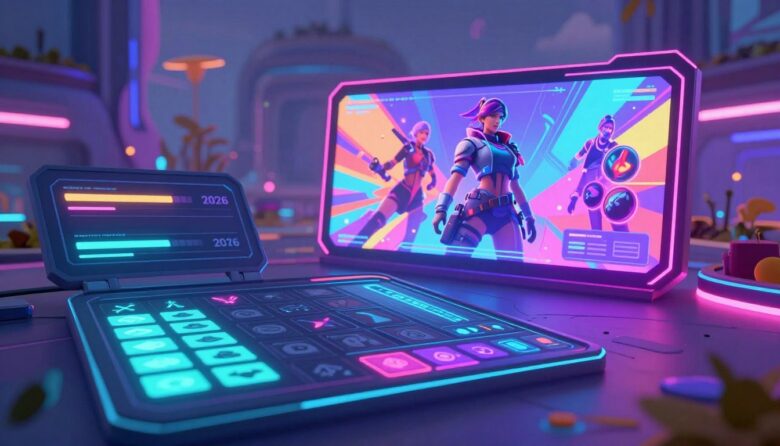
Game interface directions for 2026 The most important game UI trends in 2026 are not isolated visual effects. They are changes in how interfaces adapt to players, devices, input methods, accessibility needs, and increasingly complex game worlds. The strongest direction is toward interfaces that offer more control while showing less unnecessary information. Accessible by default …
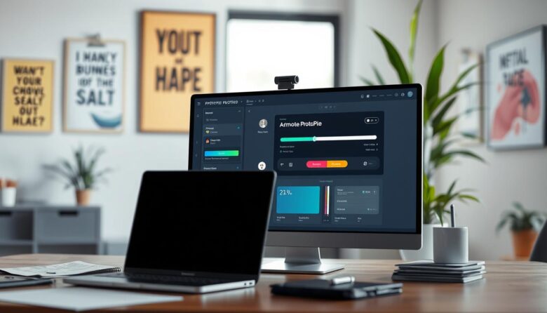
Advanced interaction prototyping workflow Complex software interfaces are difficult to evaluate with static screens because their quality depends on state, logic, input, timing, and feedback. ProtoPie helps designers turn visual layouts into interactive simulations using triggers, responses, variables, formulas, conditions, components, and device testing—without requiring production code. Model behavior Define what the interface remembers, changes, …
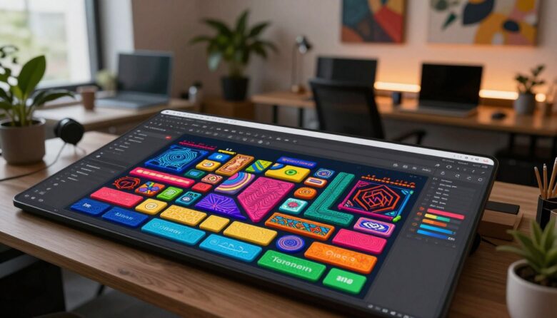
Expressive interface design with controlled complexity Tactile maximalism uses depth, texture, bold color, distinctive typography, and responsive feedback to give a digital interface a stronger sense of material and personality. The goal is not to cover every surface with effects. It is to make important controls feel recognizable, responsive, and deliberately crafted. Visual depth Layers …

A production-ready 3D icon workflow High-gloss 3D icons combine a clear silhouette with curved geometry, controlled reflections, consistent lighting, and careful export decisions. The strongest icons do not rely on shine alone: they remain recognizable at their intended size, fit the interface hierarchy, and preserve their meaning on light, dark, and customized backgrounds. Design the …

Dark interface design without costly shortcuts A dependable dark mode is not a reversed light palette. It is a complete appearance system with its own surfaces, text hierarchy, component states, imagery, charts, focus indicators, and implementation rules. The goal is to preserve clarity and user control under different lighting conditions—not simply to make the interface …
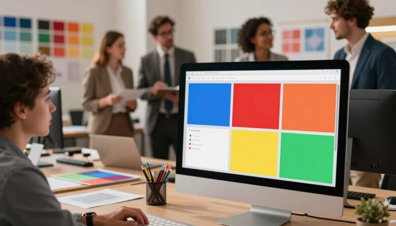
Evidence-aware color strategy for digital interfaces Color can support attention, grouping, state recognition, brand identity, and emotional tone. It cannot reliably force every user to feel or act in the same way. Effective interface palettes combine research, learned conventions, accessibility, cultural context, semantic consistency, and testing with the people who will use the product. Meaning …
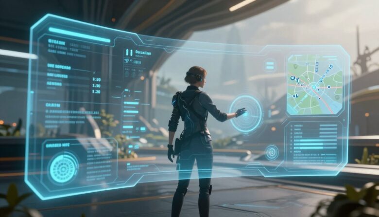
Player-centered HUD design framework An immersive HUD does not need to disappear. It needs to deliver the right information at the right moment, in a form players can recognize without abandoning the action. Strong HUD design balances clarity, timing, hierarchy, accessibility, visual identity, and player control. Prioritize decisions Show information according to what the player …