
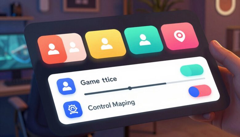
An accessible game menu helps players perceive available options, understand what each control does, navigate with supported input methods, and recover from mistakes. Indie teams do not need a huge accessibility department to improve this experience. They need a dependable menu architecture, readable defaults, visible focus, accurate labels, flexible input, and testing that includes the paths players use before gameplay begins.
Game accessibility is not the same as web accessibility. A Unity or Unreal menu does not automatically expose a browser DOM, semantic HTML, or ARIA information to a screen reader. Games need engine-appropriate accessibility metadata, platform integration, or a dedicated narration system. HTML semantics apply directly only when the interface is actually web-based.
What makes a menu accessible?
Accessibility is not one feature such as colorblind mode or larger subtitles. A player may need to read small menu text, navigate without analog movement, hear which setting has focus, avoid button holds, understand an unfamiliar control, or reverse a mistaken change.
Perceivable
Text, focus, values, warnings, and state changes remain visible or available through another appropriate sensory channel.
Operable
Players can reach, adjust, confirm, cancel, and leave each screen without requiring one precise device or physically demanding gesture.
Understandable
Labels, hierarchy, descriptions, values, prompts, and consequences make the interface predictable before activation.
Do not hide accessibility behind an inaccessible main menu. A first-launch accessibility screen, accessible defaults, or imported platform settings can help players configure narration, text, contrast, captions, motion, and input before navigating the complete interface.
Anatomy of a clearer settings menu
Make menu text readable by default
Small teams sometimes reduce font size to fit translations or preserve artwork. That choice can block players sitting far from a television, using a handheld screen, playing through streaming, or experiencing low vision.
Microsoft’s Xbox Accessibility Guidelines currently recommend minimum default text heights based on platform and resolution. These are useful production targets rather than universal legal thresholds.
| Area | Practical target | Implementation advice | Failure to avoid |
|---|---|---|---|
| Console menu text | At least 26 px body height at 1080p | Evaluate at television viewing distance, not only on a development monitor | Using a decorative 18 px font because it fits the mockup |
| PC and VR menu text | At least 18 px body height at 1080p | Test different monitor sizes, scaling settings, and headset readability | Assuming all PC players sit close to the screen |
| Text scaling | Support up to 200% of the recommended minimum without loss of meaning or function | Allow reflow, vertical scrolling, and flexible-height controls | Clipping descriptions or hiding the current value |
| Standard important text | At least 4.5:1 contrast against its actual background | Measure over gradients, artwork, transparency, video, and disabled states | Testing only against the flat color in the design system |
| Large text | At least 3:1 when it meets the applicable large-text definition | Do not assume bold text automatically qualifies as large | Using low-contrast headings because they appear visually prominent |
- Provide a readable sans-serif option when the game uses a heavily stylized typeface.
- Apply text settings to labels, descriptions, values, prompts, maps, notifications, errors, and overlays.
- Scale button glyphs and the characters inside them with surrounding text.
- Use opaque or adjustable text backgrounds when artwork makes contrast unreliable.
- Avoid long lines of centered or fully justified instructional text.
- Test every supported language with real translations rather than placeholder strings.
Build predictable navigation and focus
Every menu should be fully operable with supported digital input. A player using a D-pad or arrow keys should not need analog precision to reach a slider, tab, dropdown, close control, or scrollable description.
Move where players expect
Directional input should move toward the nearest meaningful control in that direction. Sequential navigation should follow the menu’s meaning and visual flow.
Always show the active control
Combine outline, fill, size, weight, shape, or another strong treatment. Focus must never move to an invisible, disabled, covered, or off-screen element.
Keep focus inside the current dialog
When a confirmation dialog opens, move focus to an appropriate action and prevent navigation into the covered screen until the dialog closes.
Menu wrapping is not automatically inaccessible. Moving from the last option to the first can be efficient when it is consistent and clearly communicated. It becomes confusing when the wrap is unexpected, silent, or different between screens.
Keep interaction conventions stable. Select, back, reset, tab switching, page navigation, and value adjustment should use consistent inputs throughout the game. When controls are remapped, every prompt and controller diagram must display the updated binding.
Design narration as structured information
Screen narration is more than reading visible strings. A player needs the control’s name, role, current value or state, position within a group, available interaction, and any description required to understand the consequence.
Example narration string
The description and complete interaction instructions do not need to repeat after every small value change. Announce the new value immediately while avoiding unnecessary speech that slows navigation.
- Narrate headings, tabs, labels, roles, values, descriptions, errors, notifications, and input prompts.
- Announce when a new screen, dialog, loading state, or gameplay context becomes active.
- Identify list position when it helps orientation, such as “3 of 8.”
- Read updated slider or selector values as they change.
- Provide equivalent descriptions for meaningful diagrams and controller maps.
- Keep narration available from the earliest screen where players may need it.
Support flexible input without creating complex gestures
Menu interaction should not require rapid tapping, long holds, simultaneous buttons, or analog movement when a simpler digital alternative can perform the same function.
| Control | Accessible behavior | Alternative | Common problem |
|---|---|---|---|
| Slider | Focus once, then adjust with left and right digital input | Step buttons or a selectable value list | Holding one button while moving a stick |
| Toggle | One activation switches state and announces the new value | On and Off radio choices | Using color alone to communicate the state |
| Tabs | Predictable shoulder-button, arrow, or direct navigation | Sequential focusable tab labels | Changing the tab without announcing new context |
| Scrollable panel | Clear scroll controls with a visible position indicator | Page-by-page movement | Requiring precise analog scrolling |
| Close or back | Visible control plus a consistent input shortcut | Remappable command | Providing only a tiny mouse target or the Escape key |
Give errors and destructive actions enough context
Players may activate the wrong option because of motor differences, unfamiliar controls, voice-input errors, cognitive load, or a simple accidental press. The interface should help them identify the problem and recover without losing progress.
- Explain what failed and provide a practical correction when it is safe to do so.
- Visually emphasize the affected control and announce the error through narration.
- Preserve correctly entered information after a recoverable validation error.
- Warn about unapplied changes before leaving a settings screen.
- Require review and confirmation before deleting saves, overwriting progress, purchasing, selling rare items, or resetting data.
- Use specific labels such as “Delete save permanently” instead of a vague “Yes.”
- Provide cancel, undo, restore default, or another reversal mechanism whenever practical.
Do not place focus on the destructive option automatically. When a dialog opens, choose the safest sensible default and make the consequence explicit before the player confirms.
A realistic workflow for indie teams
Build accessibility into the menu architecture
Start with essential pathways, then expand coverage without rebuilding the whole interface.
-
Inventory every menu screen
Include first launch, title screen, pause, settings, save selection, inventory, map, store, multiplayer lobby, character creation, error dialogs, credits, and platform-link screens.
-
Map navigation and focus
Document the default focus, directional movement, sequential order, modal boundaries, scrolling, Back behavior, and the focus destination after a screen closes.
-
Create reusable accessible controls
Build one dependable button, toggle, slider, dropdown, tab, dialog, tooltip, and scroll panel with labels, states, focus, input, narration data, and scalable text.
-
Expose accessibility before gameplay
Provide an early configuration screen or accessible defaults for narration, text, contrast, captions, motion, audio, difficulty, and input.
-
Test with content extremes
Use 200% text, long translations, many save files, unavailable options, maximum slider values, offline errors, empty states, and simultaneous notifications.
-
Test with players and assistive technology
Automated checks and keyboard-only review are useful, but they do not replace feedback from players who use narration, adaptive controllers, screen magnification, alternate input, or other access features.
Prioritize features when time is limited
Prevent complete blockers
Readable text, strong contrast, visible focus, digital navigation, consistent Back behavior, input prompts, safe confirmation, and an accessible path to settings.
Add player configuration
Text scaling, high contrast, remapping, no-hold alternatives, reduced motion, customizable colors, scalable glyphs, and improved error recovery.
Support nonvisual operation
Complete menu narration, narrated values and descriptions, alternative cues, accessible maps, multiplayer communication support, and platform-setting integration.
Ship fewer controls with consistent accessibility rather than many custom widgets that behave differently. A reusable component library reduces testing effort and prevents regressions across menus.
Unity and Unreal implementation notes
Control focus deliberately
Unity UI Toolkit provides focusable elements, focus order, focus controllers, tab index behavior, and navigation events for keyboard, D-pad, joystick, Escape, Enter, and arrow input.
Inspect the visual tree order, set focus explicitly when dialogs open, and verify that disabled or hidden controls cannot receive focus. Engine focus support does not automatically provide complete game-menu narration.
Use layered input and cardinal navigation
Unreal Engine’s Common UI system includes reusable widgets, shared style assets, input routing, controller-specific prompts, and cardinal gamepad navigation.
Define which layer owns input when menus, dialogs, inventories, or pause screens overlap. Restore focus to a meaningful control when a layer closes and update prompts when the active input device changes.
Test menus under realistic conditions
Disconnect the mouse
Complete every menu path using only keyboard digital input and again using only a controller D-pad and buttons.
Test distance and scaling
Review on a television, handheld, laptop, and lower-quality display with maximum text scale and high-contrast settings.
Listen without visual dependence
Confirm that labels, roles, values, positions, descriptions, context changes, errors, and interaction prompts are complete.
Trigger every failure state
Test unavailable services, invalid names, full save storage, unsaved settings, failed purchases, and interrupted connections.
Use long and complex strings
Verify reflow, glyph coverage, sentence case, wrapping, descriptions, button prompts, and narrated pronunciation.
Retest shared components
A change to one button, focus style, input route, font, or dialog can affect many screens across the game.
Common mistakes to avoid
Using a subtle glow for focus
It can disappear against artwork, blur, bloom, bright backgrounds, or television viewing distance.
Testing menus only with a mouse
Hover and direct pointing can hide broken directional navigation, unreachable controls, and incorrect focus restoration.
Creating inaccessible first-launch screens
Narration and readable text are not useful when players cannot reach the settings required to enable them.
Relying on color for selected states
Add an outline, shape, marker, label, fill, weight change, sound, or narration state.
Using generic icon-only controls
Unfamiliar arrows, gears, crosses, and symbols need visible labels, tooltips, or accurate narration.
Forcing button holds on sliders
Let players select the control once and adjust it with individual digital inputs.
Moving focus behind a dialog
Focus should remain inside the active modal until the player confirms or cancels it.
Confirming destructive actions with “Yes”
Use action-specific wording that states exactly what will be deleted, overwritten, purchased, or reset.
Production checklist
- Accessibility options are reachable from first launch. Players do not need to navigate inaccessible screens before configuring essential support.
- Menu text meets readable default targets. Font size, contrast, style, spacing, and language coverage are tested on target displays.
- Text can scale without loss. Labels, descriptions, values, prompts, dialogs, and glyphs remain complete at the largest supported size.
- Every focusable control has a strong visible indicator. Focus never moves to hidden, disabled, covered, or off-screen elements.
- Navigation is logical and consistent. Directional movement, select, back, tabs, pages, and value adjustment behave predictably.
- Menus support digital input. No essential control requires analog precision, rapid tapping, simultaneous input, or a prolonged hold.
- Remapped controls update every prompt. Tutorials, button glyphs, help text, and control diagrams reflect the active binding.
- Narration communicates complete context. Name, role, value, position, description, state changes, errors, and required interaction are available.
- Dialogs manage focus safely. Players cannot accidentally operate the covered screen while a modal is active.
- Errors explain correction. Messages identify the problem without exposing sensitive information or clearing valid input.
- Destructive actions can be reviewed or reversed. Delete, overwrite, reset, purchase, and permanent changes receive appropriate confirmation.
- Representative players tested the menu. The process includes assistive technology and real accessibility needs, not only internal keyboard checks.
Frequently asked questions
Does every indie game need full screen-reader support?
Complete narration can require substantial planning, but teams should still evaluate it early. At minimum, avoid architecture that makes future narration impossible and prioritize nonvisual access to critical menus when the game’s design supports it.
Is keyboard navigation enough for an accessible PC menu?
No. Keyboard access is important, but text readability, contrast, focus, narration, context, error recovery, remapping, timing, motion, and alternate feedback also matter.
Should menu navigation wrap from the last item to the first?
It can, provided the behavior is consistent and players receive enough visual, audio, or narrated context to understand that wrapping occurred. Unexpected wrapping can be disorienting.
Can icons replace menu labels?
Familiar icons may support recognition, but important controls should still have an understandable visible or narrated label. Meaning should not depend on guessing a symbol.
How large should console menu text be?
Current Xbox Accessibility Guidelines recommend a minimum default body height of 26 pixels at 1080p and support for scaling to 200% of that minimum. The final design should also reflect viewing distance and target hardware.
Should accessibility settings apply immediately?
Immediate preview is useful for text, contrast, audio, and many presentation settings. Preserve a clear reset option and warn players before leaving when unapplied changes would otherwise be lost.
Is a colorblind mode enough for menu accessibility?
No. Color customization can help, but focus, states, warnings, and categories should also use labels, shapes, outlines, patterns, values, or other non-color cues.
What should a small team implement first?
Start with readable defaults, accessible first launch, visible focus, digital navigation, consistent controls, scalable text, clear errors, safe confirmation, and reusable accessible components.
Final perspective
An accessible menu is the entrance to the game. Players should not be blocked before they can start, configure controls, understand the interface, or discover available accessibility features.
Small teams can make meaningful progress by building a clear component system, using readable defaults, preserving focus, supporting digital input, exposing complete labels and values, and designing errors and destructive actions carefully.
Accessibility improves most reliably when it is part of the menu architecture rather than a collection of late-stage switches. Build the core pathways first, test them with real players, and expand from a stable foundation.
Official accessibility and implementation references

The Skinning Toolkit Editorial Team creates practical content about game UI design, UX strategy, accessibility, prototyping, and digital design tools. Our articles are researched using official documentation, reliable industry sources, and real interface examples to help designers build clearer, more accessible, and engaging user experiences.