
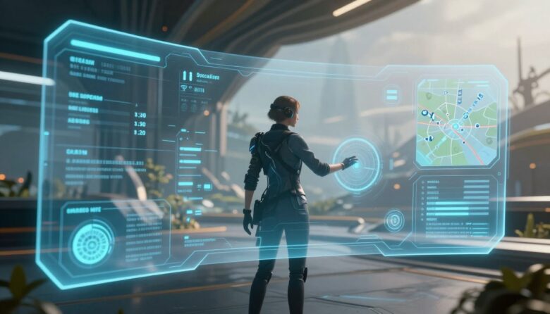
An immersive HUD does not need to disappear. It needs to deliver the right information at the right moment, in a form players can recognize without abandoning the action. Strong HUD design balances clarity, timing, hierarchy, accessibility, visual identity, and player control.
The central principle: player focus is not protected by hiding the interface. It is protected by reducing unnecessary competition while keeping critical information dependable and easy to retrieve.
Think of the HUD as an attention system
A heads-up display communicates the current state of the game while the player is already watching, listening, navigating, aiming, planning, or responding to another event. Every HUD element therefore competes for a limited amount of attention.
The design challenge is not simply deciding which statistics are useful. It is deciding which information deserves immediate attention, which information can wait, and how the player can recover anything that temporarily disappears.
Critical
Information that may require an immediate decision, such as severe damage, a dangerous attack, loss of oxygen, or a time-sensitive failure.
Persistent
Frequently checked values that support repeated decisions, such as health, ammunition, cooldowns, team status, or available resources.
Contextual
Information needed only during a specific activity, such as interaction prompts, stealth awareness, vehicle controls, or mission updates.
On demand
Details that can remain inside a map, log, inventory, codex, scoreboard, expanded HUD, or deliberately summoned panel.
Do not classify information by tradition alone. Ammunition may be critical in one combat system and almost irrelevant in another. The correct priority depends on the decisions the game asks players to make.
Interactive HUD focus lab
Use the controls below to compare different information densities and gameplay contexts. The example demonstrates how the same HUD architecture can adapt without making essential information unpredictable.
Cold resistance · 42 seconds
Ally distance · connection · role
Balanced exploration mode preserves status, navigation, objective, activity, and the relevant interaction prompt while removing combat-only elements.
Notice the recall path: hiding the objective from the minimal view is safe only when players can retrieve it reliably through a map, mission log, shortcut, narration option, or another accessible method.
Place information according to the player’s task
There is no universal corner or “golden triangle” that solves every HUD. Placement depends on the camera, control scheme, genre, platform, viewing distance, action area, environmental composition, and frequency with which the information is checked.
| Information | Useful placement strategy | Reason | Risk to test | Possible fallback |
|---|---|---|---|---|
| Health or survival state | Stable screen region or clearly integrated equipment display | Players may need to check it repeatedly during danger | Being hidden by effects, scenery, or temporary notifications | Audio warning, haptic pattern, character cue, or configurable alert |
| Aiming information | Near the action or target area | Reduces unnecessary eye movement during precise control | Covering the target or blending into the environment | Adjustable reticle, outline, size, color, and opacity |
| Objective guidance | Environment marker, compass, map, or on-demand direction | Connects navigation information to the world | Creating a permanent “follow the marker” experience | Optional guidance level, mission log, landmarks, or narration |
| Interaction prompt | Near the relevant object or within a predictable prompt region | Clarifies the relationship between action and target | Jumping rapidly between several nearby objects | Target lock, cycling, larger activation area, or persistent label |
| Team status | Grouped panel with consistent order | Supports rapid comparison of several players | Reordering unexpectedly or relying on color alone | Names, role icons, shapes, audio cues, and customizable colors |
| Notifications | Dedicated region away from aiming and subtitles | Prevents unrelated messages from covering active gameplay | Long queues, repeated animation, and expired information | History panel, summary, priority rules, or manual dismissal |
Choose a HUD architecture that fits the game
Interface architecture is not a competition between immersive and traditional design. Most effective games use a hybrid system because different information needs require different levels of reliability and integration.
Useful for urgent, frequently checked, or complex information. It is dependable but can compete with the scene when too many elements remain visible.
Useful when information belongs to a location or object. It must handle distance, occlusion, camera angle, clutter, and movement.
Useful for object-related status and world-building. It can become inaccessible when the object is small, off-screen, damaged, or difficult to reach.
Often the most practical approach: world-integrated feedback for atmosphere, dependable overlays for critical information, and menus for detail.
For a deeper examination of spatial and diegetic placement, read our guide to designing diegetic interfaces for virtual reality .
Design contextual behavior that players can predict
A contextual HUD can reduce clutter, but unpredictable appearance is distracting. Every adaptive element needs explicit rules for when it enters, how long it remains, what dismisses it, and how it can be recalled.
Why does it appear?
Connect the element to a clear event, state, location, action, threshold, or player request.
What can it replace?
Define whether a critical warning may interrupt notifications, dialogue, tutorials, or other lower-priority content.
How long is enough?
Keep the information available long enough to perceive and act, accounting for reading, translation, and cognitive access needs.
What makes it disappear?
Use state completion, explicit dismissal, safe timeout, or distance—not an arbitrary animation ending.
How can it be recovered?
Store important messages in a log, map, objective list, tutorial library, or accessible shortcut.
What happens simultaneously?
Define how alerts, captions, prompts, objectives, chat, tutorials, and platform notifications share space.
Avoid rapid interface flicker
A contextual element should not repeatedly appear and disappear when the player moves around a threshold. Add stable activation zones, short delays, target locking, or state memory so prompts do not flicker between nearby objects.
Preserve important history
A notification that disappears after three seconds should not be the only record of a new objective, changed rule, lost resource, accessibility instruction, or irreversible decision.
Design for readability during gameplay, not in a static mockup
- Test over bright, dark, detailed, foggy, colorful, and rapidly changing environments.
- Review the HUD during camera rotation, recoil, sprinting, vehicle motion, and visual effects.
- Use stable text backgrounds, outlines, shadows, or edge treatments where scenery changes contrast.
- Test long translations, dynamic numbers, multiple status effects, and maximum text settings.
- Place essential text outside areas frequently covered by subtitles, streaming overlays, or platform messages.
- Review the real viewing distance on monitors, televisions, handheld devices, and mobile screens.
- Do not place essential labels inside static image assets when they need scaling or contrast adjustment.
Do not shrink HUD text to preserve the art. If readable content no longer fits, simplify the information, reflow the layout, create another density profile, or move detail to an on-demand panel.
Use multiple feedback channels carefully
Microsoft’s Xbox Accessibility Guidelines recommend expressing important visual and audio cues through additional sensory methods. This helps players with disabilities and also supports people playing in noisy rooms, on small displays, or without a particular device feature.
Visual
Use text, symbols, direction, shape, values, patterns, and controlled motion. Do not rely on color alone.
Audio
Use recognizable alerts, spatial direction, speech, and confirmation with captions or visual alternatives.
Haptic
Use consistent patterns for damage, impact, boundaries, or confirmation, with adjustable intensity where supported.
Text and narration
Provide clear wording, accessible text display, captions, objectives, and screen narration support where the platform allows it.
| Gameplay event | Primary cue | Supporting cue | Customization | Failure to avoid |
|---|---|---|---|---|
| Low health | Readable health value or state | Audio warning, haptic pattern, character behavior, or optional screen effect | Intensity, color, sound, haptic, and alert position | Using a red screen effect as the only information |
| Incoming attack | Directional visual indicator | Spatial audio and optional haptic direction | Size, opacity, duration, sound, and color | Indicator disappearing against bright scenery |
| Objective update | Short text notification | Audio cue, narration, map change, or mission-log entry | Display duration and reminder frequency | Making a temporary toast the only record |
| Ability ready | Icon and value state | Sound, haptic pulse, border change, or spoken cue | Cue type, intensity, and frequency | Communicating readiness only through a hue change |
| Interactive object | Visible target treatment and prompt | Audio cue, controller response, narration, or target lock | Outline, color, label detail, and prompt mode | Making every nearby object flash simultaneously |
Give players meaningful HUD controls
Customization can improve readability and comfort without requiring every component to be freely dragged around the screen. Begin with options that solve the most common access and platform problems.
- Overall HUD scale and safe-zone adjustment
- Text size, backgrounds, outlines, and contrast
- Reticle shape, size, thickness, opacity, and color
- Individual visibility for secondary HUD modules
- Minimal, contextual, standard, and expanded information profiles
- Custom team, enemy, objective, and interaction colors
- Color-independent symbols, patterns, labels, and markers
- Notification duration and history
- Reduced HUD motion and screen effects
- Audio, caption, haptic, and narration alternatives
Preview customization in a representative scene. A color picker or slider is more useful when players can see the result over shadowy, midtone, bright, and visually busy gameplay backgrounds.
A practical HUD design workflow
From gameplay decisions to a tested interface
Build the communication model before polishing the artwork.
-
List the decisions players make
Begin with actions and consequences rather than a list of statistics. Document what players decide during exploration, combat, dialogue, crafting, navigation, teamwork, and failure recovery.
-
Create an information inventory
Record every value, warning, objective, prompt, notification, status, marker, tutorial, caption, and communication channel the game may display.
-
Assign priority and presentation
Classify each item as critical, persistent, contextual, or on demand. Decide whether it belongs in screen space, world space, a diegetic object, audio, haptics, narration, or a hybrid combination.
-
Define timing rules
Document triggers, duration, interruption priority, dismissal, repeat behavior, conflict handling, and recall paths for every temporary element.
-
Wireframe over real gameplay
Use representative screenshots and recorded sequences rather than an empty gray canvas. Include subtitles, effects, enemies, objectives, streaming overlays, and platform-safe areas.
-
Prototype several density profiles
Compare persistent, contextual, minimal, and expanded approaches. Verify that each profile preserves the information needed to make correct decisions.
-
Build accessible component states
Design text scaling, contrast, color alternatives, focus, narration metadata, reduced motion, notification history, and input-specific prompts before implementation is complete.
-
Test during representative pressure
Include first-time learning, busy combat, low resources, several simultaneous alerts, controller changes, long sessions, and different displays.
-
Measure comprehension, not decoration
Record missed warnings, delayed decisions, wrong actions, repeated menu checks, unreadable text, unwanted eye travel, and reliance on unavailable feedback channels.
-
Document the final rules
Store priority, tokens, safe zones, animation, durations, states, platform behavior, localization limits, accessibility options, and performance requirements in the UI system.
Implementation notes for Unity and Unreal Engine
Separate structure, styling, and live data
Unity UI Toolkit supports runtime interfaces through UI Documents, UXML structure, USS styling, event handling, and C# behavior. Panel Settings can control scale and resolution behavior, while safe-area handling is important on mobile displays with cutouts.
Keep HUD values connected to gameplay data rather than duplicated inside presentation code. Reusable components should expose clear states for health, cooldowns, objectives, alerts, prompts, and accessibility settings.
Plan input routing and layered UI
Unreal Engine’s Common UI system supports layered interfaces, input routing, platform-specific action prompts, gamepad navigation, and shared style assets.
Define which layer receives input when a map, inventory, dialog, pause menu, or notification is active. Preserve focus when layers open and close, and ensure the Back action behaves consistently across platforms.
Test the HUD under realistic conditions
Can new players interpret it?
Test icons, warnings, objectives, interaction prompts, map markers, and status effects before the participant has memorized the system.
Does information survive chaos?
Use several enemies, camera movement, damage effects, dialogue, particles, notifications, and rapidly changing values.
Does the HUD become unnecessarily loud?
Review exploration, narrative scenes, waiting, planning, observation, and calm environments where persistent elements may dominate.
Are equivalent cues complete?
Test without audio, without haptics, without color distinction, with larger text, reduced motion, narration, and customized contrast.
Does it adapt correctly?
Review televisions, handhelds, monitors, mobile screens, cloud streaming, different aspect ratios, safe areas, and controller prompts.
Can the player recover?
Pause, change input devices, open platform overlays, lose focus, reconnect, reload, and return after missing an important notification.
Useful observations during playtesting
- Which critical cues were missed?
- Which elements were checked repeatedly?
- Where did players pause because they were uncertain?
- Which notification covered another important message?
- Which icon required explanation?
- Could players recall hidden information when needed?
- Did players understand why an element appeared or disappeared?
- Did customization preserve all essential meaning?
Eye tracking can reveal gaze patterns, but it does not prove understanding. Combine gaze data with task performance, errors, verbal feedback, observed behavior, and player recall.
Common HUD mistakes
Showing everything permanently
Persistent access is useful for some data-heavy genres, but every element still needs a reason to occupy the play space continuously.
Hiding critical information for immersion
Players should not be forced to open a menu or turn toward an in-world object during a time-sensitive threat.
Using color as the only state signal
Add values, labels, shapes, icons, patterns, animation alternatives, sound, or haptics according to the event.
Placing notifications over subtitles
Reserve distinct regions and define conflict rules for dialogue, captions, tutorials, objectives, chat, and system messages.
Making contextual prompts flicker
Stabilize target selection, activation distance, duration, and priority when several objects are available.
Animating every update
Constant motion competes for attention. Reserve noticeable animation for changes that require awareness or explain a transition.
Testing only on an empty background
Real gameplay contains lighting changes, effects, scenery, enemies, video, motion, and overlapping interface content.
Using one layout for every platform
Viewing distance, aspect ratio, safe area, input, performance, and screen size require responsive rules and platform testing.
Removing information without a recall path
Minimal presentation becomes frustrating when objectives, tutorials, notifications, or status details cannot be retrieved.
Assuming visual polish guarantees focus
A beautiful HUD can still interrupt play through poor timing, weak contrast, unclear icons, excessive density, or unpredictable behavior.
Production checklist
- Every element supports a player decision. Decorative treatment does not occupy space intended for critical gameplay information.
- Information has a documented priority. Critical, persistent, contextual, and on-demand content follow different presentation rules.
- Temporary elements have complete timing rules. Trigger, duration, interruption, dismissal, conflict, and recall are defined.
- Critical information remains dependable. It is not hidden by scenery, effects, animation, subtitles, notifications, or another interface layer.
- Text is readable during gameplay. Testing includes motion, changing backgrounds, long translations, viewing distance, and maximum supported scale.
- Important cues use more than one method. Visual, audio, haptic, textual, and narration alternatives are included where appropriate.
- Color is not the only source of meaning. Shapes, values, icons, patterns, labels, or other cues preserve distinctions.
- Contextual elements behave predictably. Prompts and markers do not flicker, jump, or disappear before the player can respond.
- Players can retrieve hidden information. Objectives, tutorials, history, status, and navigation remain available on demand.
- Customization has been tested as a complete system. Scaling, recoloring, hiding, repositioning, and reduced motion do not remove essential meaning.
- Input and focus behavior are documented. Controller, keyboard, mouse, touch, and accessibility devices receive correct prompts and navigation.
- Representative platforms were tested. The review includes actual target displays, safe areas, performance limits, and gameplay environments.
Frequently asked questions
Should an immersive HUD always be minimal?
No. Strategy games, simulations, MMOs, competitive games, and management systems may require persistent access to substantial information. The goal is controlled priority and readable organization, not the smallest possible number of elements.
Is a diegetic HUD more immersive than a traditional overlay?
It can strengthen world-building when information naturally belongs to an object or character. It can reduce immersion when players struggle to find, read, or access it. Hybrid systems are often more reliable.
Where should health and ammunition be placed?
Placement depends on the game’s camera, pace, target area, genre, platform, and frequency of use. Test several positions during representative gameplay rather than copying a universal layout.
Should HUD elements disappear outside combat?
Secondary combat information may settle when it is irrelevant, but players should retain access to status and objectives they may still need. Provide predictable triggers and a manual recall method.
Can color-blind modes solve all HUD color problems?
No. Custom colors can help, but important distinctions should also use labels, symbols, patterns, shapes, values, or other cues. Test the complete scene rather than isolated color swatches.
Are animated warnings better than static warnings?
Animation can attract attention, but it should be restrained, meaningful, and adjustable. The warning must remain understandable in a stable state and when reduced-motion settings are active.
How can a HUD support players with low vision?
Offer readable text, adjustable scale, stable backgrounds, strong contrast, customizable colors, larger markers, narration where supported, reduced clutter, and alternatives to small or color-only cues.
Does eye tracking reveal the best HUD layout?
Eye tracking can show where participants looked and how gaze moved, but it does not independently show comprehension, comfort, decision quality, or whether the information was remembered. Combine it with other research methods.
Final perspective
An immersive HUD is not invisible. It is appropriately noticeable.
Critical information should attract attention when a decision is required. Persistent information should remain easy to check. Contextual information should appear through understandable rules, and detailed information should be available when players request it.
Begin with gameplay decisions, build an information hierarchy, define timing and recall, add accessible alternatives, and test inside the most demanding scenes the game can produce. When the interface communicates clearly without competing unnecessarily, it supports player focus instead of interrupting it.
Official accessibility and implementation references

The Skinning Toolkit Editorial Team creates practical content about game UI design, UX strategy, accessibility, prototyping, and digital design tools. Our articles are researched using official documentation, reliable industry sources, and real interface examples to help designers build clearer, more accessible, and engaging user experiences.