
Let’s talk about something close to my heart. Creating an interface that everyone can use isn’t just a technical task. It’s about welcoming people into the worlds we build.
Around 15% of people globally live with a disability. That’s a huge part of our potential audience. The industry is noticing this, too. The Game Awards now has an “Innovation in Accessibility” category, celebrating titles that put people first.
Think about the first thing you interact with in a new title. If someone can’t navigate those initial screens, they’ll never see the amazing content we’ve created. It’s that simple, and that important.
I see this work as a creative challenge. It’s an empathetic approach that asks, “How can we make this better for everyone?” The answer often leads to a smoother, more intuitive experience for all players.
This guide is my friendly perspective on how we can do that. I’ll walk through practical steps any indie developer can take. We’ll move from core principles to specific implementation tips, all learned from real-world examples and our fantastic community.
Key Takeaways
- A significant portion of the global population has a disability, making inclusive development essential for reaching a wider audience.
- The game industry is formally recognizing and rewarding efforts in player-first features, as seen with The Game Awards.
- The opening interface is a critical gateway; if it isn’t navigable, the rest of your creation remains locked away.
- Building with everyone in mind is a creative design philosophy that improves the experience for all users.
- Practical, actionable guidance exists to help small teams implement these principles without overwhelming complexity.
- A first-person, community-informed perspective can provide relatable insights beyond a standard checklist.
Why Accessible Menu Design Should Be Your First Priority
The initial screen a person encounters should be an invitation, not an obstacle course. An unfriendly interface acts like a locked door. It turns away potential fans before they ever see your amazing content.
This isn’t just a technical hiccup. It’s an ethical choice. Prioritizing this work from the start ensures everyone gets an equal shot at the fun. Every player deserves that chance.
There’s a strong business case, too. Inclusive development opens your title to a wider, dedicated audience. Many enthusiastic consumers are overlooked. Welcoming them isn’t just good practice; it’s smart for your game’s reach.
Features built for clarity help everyone. Think about remappable controls or high-contrast text. These options benefit users who prefer a personalized experience. Clear navigation and logical button placement make life easier for all players.
Building this way from day one saves huge headaches later. Retrofitting these systems is complex and costly. Integrating them early is far more efficient for your team.
Word travels fast in our community. A title known for its thoughtful approach builds tremendous goodwill. People notice when you care about their experience. That positive talk is powerful.
Thinking inclusively can spark real innovation. It pushes you beyond standard templates. This challenge can lead to more unique and memorable interfaces. It’s a fantastic example of creative problem-solving.
Making your opening interface a priority sets the right tone. It shows you value the human on the other side of the screen. That’s the best way to build a world everyone can enjoy.
Understanding the Core Principles: More Than Just a Checklist
The foundation of any great interface isn’t found in a spec sheet. It’s built on empathy and understanding. I see this as the heart of the work.
It involves thinking beyond the literal presentation of items on a page. We must focus on what people with different abilities are experiencing. This shift in mindset changes everything.
I use the POUR framework as my guide. These four principles form a foundational mindset, not just a technical spec. They are Perceivable, Operable, Understandable, and Robust.
Each one connects to the others. Together, they create a cohesive experience for every user. Let’s break them down.
Perceivable: Making Information Available to All Senses
This core idea means presenting information through multiple channels. People should get the same data visually, audibly, or through touch.
For instance, a button shouldn’t rely only on color. It needs a clear label and a distinct sound. Haptic feedback can confirm a selection for someone who can’t see the screen.
It’s about ensuring no one misses out on critical details. Every piece of content must have an alternative way to be perceived.
Operable: Navigation Everyone Can Use
Every function must be usable without a specific tool. People should navigate using a keyboard, controller, switch, or voice commands.
A mouse shouldn’t be a requirement. This principle ensures that players with motor differences can still interact fully. Logical tab order and clear focus indicators are essential here.
It’s the difference between an open path and a locked gate. Smooth navigation is a right, not a privilege.
Understandable: Predictable and Clear Logic
Interfaces should make sense. People shouldn’t have to guess how to proceed. Predictable logic and consistent patterns are key.
Use clear language and avoid jargon. Group related items together to create a logical hierarchy. This helps all players feel confident and in control.
A confused user is often a frustrated one. Clarity is a form of respect.
Robust: Compatibility with Present and Future Tools
Your work should function across different platforms and assistive technologies. It must also withstand future updates.
This means coding with standards that a screen reader can interpret. It ensures compatibility with new hardware as it emerges. A robust design is built to last.
It’s an investment in the longevity of your project. You’re building for tomorrow’s player as well as today’s.
These principles are deeply interconnected. A visually stunning interface is useless if someone can’t navigate it with their controller. A perfectly coded page fails if its logic is confusing.
I remember a web design case study that drove this home. The team realized true accessibility required empathy. They had to think beyond the literal checklist to the actual human experience.
That’s the spirit I bring to my work. It’s not about checking boxes. It’s about opening doors.
| Principle | Key Idea | Actionable Tip for Developers |
|---|---|---|
| Perceivable | Info must be available to multiple senses. | Add text descriptions for all icons and sound cues for visual changes. |
| Operable | All functions work with various inputs. | Ensure full control via keyboard arrows and controller D-pad, not just mouse. |
| Understandable | Logic and language are clear and predictable. | Use consistent button labels and group settings into clear, labeled sections. |
| Robust | Compatible with current and future tech. | Use semantic HTML structure and test with major screen reader software. |
This table is a quick reference, but the real work is in the application. Think of these principles as your compass, not your map. They guide your creative decisions toward a more inclusive outcome.
For designers, this is a powerful example of human-centered thinking. It pushes us to solve problems in new ways. That’s how we build better game worlds for everyone.
Starting with a Clear and Logical Menu Structure
Think of your interface’s underlying code as its skeleton—it needs to be strong and well-ordered. What people see on the screen is just the surface. The real magic for inclusive interaction happens in the Document Object Model, or DOM, order.
This order dictates how a screen reader speaks your content and how keyboard taps move focus. Visual styling with CSS can rearrange items, but the code sequence is king. It’s the way you ensure everyone follows the same logical path.
I learned a powerful lesson from a web project. The team created a visually striking layout with items flowing right-to-left. Yet, the DOM kept a sensible hierarchy. A user with assistive tech experienced a coherent journey, not a confusing scramble.
We prioritized a logical information hierarchy in the code, even when the visual design presented items in a non-traditional order. That decision made all the difference.
Your first step is planning the information architecture. Don’t start with pixels. Grab a whiteboard and group related options. Put all audio sliders together. Cluster graphics settings. This logical clustering helps every player.
Label these clusters clearly. Use headings like “Audio Options” or “Gameplay Settings.” These labels provide instant context. They act as signposts in your interface.
Keep the primary navigation path simple and shallow. Avoid deeply nested sub-menus that require endless backing out. A flat structure is easier and faster for everyone to traverse.
- Reduced cognitive load: People find what they need without getting lost.
- Faster adjustments: Players spend less time in settings and more time playing.
- Universal benefit: A clear structure helps new users and experts alike.
This logical foundation is non-negotiable. It’s the bedrock for every other feature, like smooth keyboard control. If the structure is messy, adding remappable buttons won’t fix the core confusion.
For designers and developers, this is a fundamental shift. You build the experience from the code out, not the visuals in. It’s a way of thinking that serves all players from their very first interaction with your game.
Designing for Keyboard Navigation First
I always start my interface work by unplugging the mouse. If every function isn’t reachable with the Tab, Enter, and Arrow keys, the foundation isn’t solid. This “keyboard-first” philosophy ensures a clean, logical path exists before any mouse polish is added.
It creates a clean, uncluttered presentation for everyone. The navigation journey should feel intuitive, not like a hidden puzzle.
Logical Tab Order is Non-Negotiable
When a person presses Tab, the focus must move in a predictable way. It should follow the visual flow, moving from top to bottom and left to right. This logical sequence is crucial for all players, especially those using assistive tech.
A mismatched order creates confusion. Imagine the cursor jumping randomly across the screen. That’s disorienting for everyone.
I recall a web project where the team mapped out every single tab stop. They planned the entire navigation journey in code first. This meticulous planning served as a perfect example for building intuitive systems.
Collectivebyelvis hsiaogoogle says a logical information hierarchy in the code makes all the difference. Your tabs should tell a clear story.
Clear Visual Focus Indicators
People must always know which element is selected. A subtle highlight isn’t enough. You need a clear, high-contrast indicator.
Think of a glowing border or a bold color change. This visual hierarchy is a non-visual cue, too. It helps players with low vision or those who are distracted.
Without it, navigation feels like guessing. A strong focus state is a beacon on the screen. It says, “You are here.”
Why Menu Looping is a Problem and How to Fix It
Many interfaces loop. Pressing down at the last item circles back to the top. For a sighted player, this might seem convenient.
For someone using a screen reader, it’s disorienting. They lose their spatial sense in the list. Suddenly, they’re back at the top without a clear cue.
The solution is simple: indicate the boundary. When the cursor hits the bottom, provide feedback.
A subtle “bonk” sound works wonders. A small visual shake on the last button also helps. Titles like Diablo III use this technique effectively.
It tells the player, “You’ve reached the end.” This is crucial for allowing blind players to understand their position.
My best test is to turn the monitor off. Try using only your keyboard to navigate your own game. You’ll experience the interface as a blind reader would. It’s the most honest feedback you can get.
Building for keyboard control first isn’t a limitation. It’s a commitment to clear, robust design. It makes your menus work for everyone, from day one.
Ensuring Your Menus Work Flawlessly with Screen Readers
Screen readers transform visual content into spoken words, but they need the right cues from your code. This software is a vital tool for many people. It reads on-screen text and interprets interface structure.
If your system doesn’t provide clear signals, the experience becomes confusing. The player might hear a jumble of words without context. My goal is to help you build a seamless conversation between your interface and the reader.
Semantic HTML and Proper ARIA Labels
Think of semantic HTML as speaking a clear, universal language. Using the correct element, like <button> for a clickable button, tells the assistive tech exactly what it is. A <div> styled to look clickable doesn’t convey function.
Sometimes, the visible text isn’t descriptive enough. That’s where ARIA (Accessible Rich Internet Applications) attributes shine. They provide extra information that a screen reader can announce.
For each of the elements on the left side of the separator, we used the aria-label attribute to provide a user-friendly screen reader announcement… “Email Last Call Media at…”
This turns a vague “Facebook” link into “Last Call Media on Facebook.” It gives context instantly. Your content becomes more meaningful.
| Element Type | Semantic HTML | ARIA Enhancement | Result for User |
|---|---|---|---|
| Action Button | <button>Save</button> |
aria-label="Save current game settings" |
Hears purpose, not just a label. |
| Toggle Switch | <div role="switch"> |
aria-checked="true" |
Hears “on” or “off” state clearly. |
| Navigation Link | <a href="#">News</a> |
aria-current="page" |
Knows they are on the current page. |
| Group of Options | <div> |
role="menu" aria-label="Sound Settings" |
Understands the group’s purpose immediately. |
User-Friendly Announcements for Buttons and Links
Announcements should do more than read raw text. They must explain what will happen. A button labeled “>” is meaningless. Announcing “Open sub-menu” is helpful.
State changes are critical. When a sub-panel opens or a slider moves, the user needs to know. Use ARIA live regions or role alerts for dynamic content.
This proactive communication builds confidence. The player feels in control of the interface. They aren’t guessing about the results of their actions.
Avoiding the Dreaded “Keyboard Trap”
A keyboard trap occurs when focus gets stuck. The player can’t tab out of a loop or a modal dialog. It’s a frustrating dead end.
I encountered this in a web project. The solution was elegant and logical.
The solution we arrived at to get past our keyboard trap was to move from the last item to that navigation button that we bypassed earlier.
In practice, after the last setting in a list, focus should jump to a “Close” or “Apply” control. This provides a clear, expected exit. It respects the player’s navigation flow.
Testing with real tools is non-negotiable. Use NVDA on Windows or VoiceOver on Mac. Listen to your interface as others do.
You’ll catch awkward phrasing and trapped focus. This hands-on check ensures your design truly works for everyone. It turns good intentions into a great experience.
Mastering Visual Hierarchy and Readability
Visual clarity isn’t just about aesthetics. It’s about communication and ease. A strong visual hierarchy guides the player effortlessly. It tells them what’s important and where to look first.
This organization reduces confusion. People can find options quickly. They feel in control of the screen. Good design here makes every interaction smoother.
I focus on three pillars for this. They are contrast, grouping, and typography. Each one builds a more readable interface.
High Contrast is Your Best Friend
Strong color contrast is the most effective tool for readability. It helps players with low vision. It also works well in bright glare or on older monitors.
I always aim for at least the WCAG AA standard. This means a contrast ratio of 4.5:1 for normal text. Free tools make this easy to check.
The Adobe Contrast Analyzer is fantastic. WebAIM’s Contrast Checker is another great choice. Plug in your colors and get an instant pass or fail.
Color choice matters for color blindness, too. Tools like Adobe Color – Accessibility help. They simulate how palettes appear to people with different vision types.
Avoid relying only on color to convey information. Use icons, labels, or patterns as well. This ensures your content is clear for everyone.
High contrast isn’t harsh. It’s a thoughtful way to make your text pop. It’s the difference between straining to read and glancing with ease.
Strategic Grouping and Spacing
Related items should look like they belong together. Use white space, subtle lines, or shaded backgrounds. This creates visual clusters.
For example, put all audio sliders in one lightly shaded box. Group graphics settings in another. The structure becomes instantly understandable.
Avoid cramming too many options into a small area. Generous padding and margins reduce visual stress. They also make selecting a button easier.
This thoughtful spacing gives the interface room to breathe. It creates a calm, organized layout. Players focus on their choices, not on deciphering the layout.
It’s a principle borrowed from great web designers. Clear grouping supports the logical information hierarchy. It benefits every user.
Legible Text Size and Font Choices
Text should be large and scalable by default. Let people read from a distance or on small screens. This prevents unnecessary strain.
I argue for a minimum base size that feels generous. Allow scaling up to 200% without breaking the layout. This is a key feature for many.
Font selection is critical. Choose simple, sans-serif typefaces with distinct letterforms. Avoid stylized or script fonts for critical text.
Fonts like Arial, Helvetica, or Open Sans are excellent. Their clean shapes are easy to parse quickly. This legibility helps all players, especially when tired or rushed.
Good typography is a silent guide. It doesn’t shout for attention. It simply makes the game world easier to navigate.
When these elements combine, they create a powerful visual hierarchy. The screen communicates clearly. This thoughtful approach benefits every person who picks up your title.
Providing Clear Audio and Haptic Feedback
Feedback is the silent language that tells a player their action was registered. It turns a simple press into a confident interaction. This layer of communication is vital for a smooth experience.
Think beyond the visual screen. Sound and touch confirm choices in a way eyes alone might miss. This approach helps everyone, especially those with visual or hearing differences.
Audio cues provide instant confirmation. A subtle “click” on selection tells you it worked. A unique error sound for wrong actions prevents frustration.
Good audio also defines boundaries. In Diablo III, a distinct “bonk” plays when the cursor hits the bottom. This prevents disorientation in lists.
It gives spatial awareness without looking. This simple feature is a great example of thoughtful design.
Haptic feedback adds a tactile layer. Controller vibration can confirm a selection. This is invaluable for deaf or hard-of-hearing players.
It turns an abstract action into a physical sensation. On supported platforms, use this power. A short pulse when highlighting a button works wonders.
Always let people adjust UI sound volume separately. Include this in your audio options. Everyone has a different comfort level with sound.
Independent sliders put control in the user’s hands. They can make interface sounds audible over loud game audio. This small option makes a big difference.
Consistent audio cues build an intuitive mental model. People learn to navigate by ear. They understand the system’s logic through sound.
This consistency helps all players feel in control. They predict what will happen next. That confidence improves the entire experience.
For advanced content, consider audio descriptions. Announcing important visual events in menus is powerful. It explains changes that sighted users see instantly.
This is more complex to implement. Yet it represents a gold standard for inclusive features. It ensures no player misses critical text or alerts.
The best strategy layers multiple feedback types. Combine visual, audio, and haptic signals. Information gets through regardless of a person’s sensory abilities.
Redundancy is a strength here. If one channel is less effective, another delivers the message. This creates a robust and welcoming interface.
| Feedback Type | Primary Function | Example Implementation | Key Benefit |
|---|---|---|---|
| Visual | Show state and highlight focus. | High-contrast glow on selected item. | Clear for sighted users in any lighting. |
| Audio | Confirm actions and indicate boundaries. | Unique “click” on press, “bonk” at list end. | Provides information without requiring visual attention. |
| Haptic | Give tactile confirmation of interactions. | Short controller vibration when a button is activated. | Essential for deaf players and adds immersion for all. |
This table shows how each type supports the others. Together, they create a complete communication system. Your interface speaks through sight, sound, and touch.
For designers, this is a creative playground. Crafting satisfying sounds and vibrations is fun. It directly enhances how people feel about your games.
Start by mapping critical actions to a sound or rumble. Test these cues with the monitor off. You’ll quickly learn what feels intuitive and what doesn’t.
Great feedback makes a world feel responsive and alive. It’s a fundamental part of building titles everyone can enjoy.
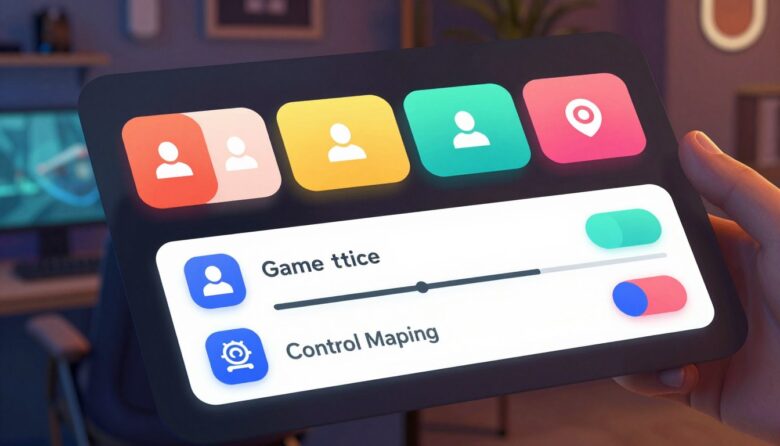
Offering Flexible and Remappable Control Schemes
My philosophy is simple: let the player decide how to play, starting with the very first button press. True control means offering choices, not enforcing defaults. This flexibility is a cornerstone of welcoming every person into your world.
It’s about respecting individual needs and preferences. Some players have motor limitations. Others might have a temporary injury. Many just have a unique way they like to interact. Your system should adapt to them, not the other way around.
Support Both Mouse and Keyboard on PC
I’ll insist on this point. A PC title should never lock someone into one input method. Every function must be reachable with a mouse and a keyboard. This dual support is non-negotiable.
Some players find a mouse more precise for selecting options. Others rely entirely on keyboard navigation due to physical needs. Forcing one excludes the other. It creates an unnecessary barrier right from the start.
Think about the logical flow. Can someone tab through every button? Can they confirm selections with the Enter key? This ensures your content is available to all users. As a developer noted in a forum, inux collectivebyelvis highlighted how foundational this dual-path logic is.
Allow Both Stick and D-Pad on Console
On consoles, the same principle applies. You must support both the control stick and the directional pad for menu scrolling. This is a basic but essential feature.
Some players find the D-pad offers crisp, precise movement between items. Others prefer the smoother analog motion of the stick. Supporting both allow players to use what feels most comfortable and accurate for them.
It’s a small implementation with a huge impact. It acknowledges that there isn’t one “right” way to navigate a screen. This choice empowers the individual.
The Importance of Supporting Adaptive Controllers
This is where flexibility becomes profound. Industry-standard devices like the Xbox Adaptive Controller and PlayStation Access Controller are game-changers. They act as hubs for a vast array of external switches, buttons, and joysticks.
Supporting them isn’t just about your game detecting the device. It’s about your input logic being robust enough to handle non-standard signals. Can it read simultaneous presses? Does it understand hold-style inputs? Your system must be ready.
This capability ties directly into full button remapping. Allow players to assign any menu action to any physical input that works for them. This is the ultimate personalization.
Including preset schemes can help. Offer “Left-Handed” or “One-Handed” layouts as a starting point. Many players might not know how to begin customizing. These presets provide a friendly welcome.
For designers, this is a powerful example of human-centered thinking. You’re not just building for a standard controller. You’re building for the person holding it, in all their wonderful variety.
This flexibility is a profound act of inclusion. It welcomes players with disabilities, those recovering from injury, and anyone with a unique preference. It says, “Your way of playing is valid here.” That’s the heart of building great video game experiences for everyone.
Implementing Adjustable Difficulty and Assistance Modes
What if difficulty wasn’t a fixed wall, but a series of dials a player could adjust to find their perfect climb? This shift in thinking transforms challenge from a barrier into a personal toolkit. It’s the heart of modern, respectful game development.
Traditional presets like Easy, Normal, and Hard are a start. Yet they’re often too broad. Granular assistance modes go deeper. They let players tweak specific parameters that cause friction.

Think about slowing enemy speed or offering unlimited lives. These features help people with motor or cognitive differences progress. They turn a frustrating blockade into a surmountable hurdle.
I celebrate titles like Celeste for their brilliant “Assist Mode.” It lets you adjust world speed, grant invincibility, or add extra dashes. Crucially, it does this without any judgment. The experience is about reaching the summit your own way.
Here are powerful options you can offer in your settings:
- Aim assist toggles for precision.
- Reduced quick-time event speed.
- Extended puzzle time limits.
- Simplified button sequences.
I must argue passionately against penalizing players for using these aids. Locking achievements or labeling saves stigmatizes the need for assistance. It sends a terrible message that their way of playing is lesser.
Avoid penalizing players for using these settings, ensuring a respectful and inclusive experience.
These options can be a lifeline. They support players with cognitive disabilities, anxiety, or those who just want a relaxed narrative experience. The goal is enjoyment, not endurance.
My recommendation is to create a dedicated “Assist” section in your settings. Make these choices easy to find. This placement normalizes their use. It tells everyone that customization is a standard, valued part of the game.
Frame these features with positive language. Use “Customize Your Experience” instead of “Reduced Difficulty.” This empowers the player. It puts them in the director’s chair for their own journey.
For designers, this is a profound example of player-first thinking. You’re not dumbing down your content. You’re building more doors into it. That’s how we create games everyone can truly enjoy.
Keeping Interfaces Clean and Uncluttered
I believe a clean screen is a kind screen—it respects the player’s focus and time from the very first glance. Clutter isn’t just visual noise. It creates cognitive overload, especially with tiny icons, flashing elements, and walls of text.
This overload can shut people out before they even start. For someone with attention difficulties, it’s overwhelming. My goal is to prevent that feeling of being lost in a messy dashboard.
I advocate for a “less is more” philosophy. Show only the most necessary information and controls on your main menu screens. Keep the primary path simple and obvious.
Use progressive disclosure for advanced settings. Hide them in a secondary panel or under an “Advanced Options” button. This keeps the main view approachable for new users.
A clean interface directly helps people with attention deficits or low vision. It reduces distractions and simplifies decision-making. Every choice feels manageable, not stressful.
This clarity is a core part of accessibility. It ensures your content is welcoming to a wider audience. The experience becomes smoother for everyone.
For icons, always pair them with clear text labels. A symbol alone can be ambiguous. “Save” next to a floppy disk icon removes all guesswork.
Ample negative space around items isn’t wasted. It’s a critical design tool. This empty space improves readability and reduces selection errors.
Good design is as little design as possible. Less, but better.
This principle applies perfectly to our work. A clean menu also performs better across different devices. It scales gracefully from a 4K monitor to a handheld Steam Deck.
Logical navigation and a clear hierarchy are essential. As noted in discussions, a logical information structure in the code makes all the difference. This thought aligns with insights from collectivebyelvis hsiaogoogle.
Ultimately, a tidy interface respects the person on the other side. It lets them focus on the joy of your game, not on deciphering the menus. That’s how we build better games for every reader.
The Critical Role of Testing with Diverse Players
Testing your interface with a diverse group is the only way to know if it truly works for everyone. I’ll state this bluntly: you cannot guarantee your system is inclusive by checking it only with your able-bodied team. Our own perspectives are limited. We miss the barriers we don’t personally face.
Real quality assurance comes from involving people with different disabilities. This includes blindness, deafness, motor impairments, and cognitive differences. These testers will find issues you never anticipated.
Imagine a color combination that’s invisible to a color-blind player. Or a navigation flow that becomes confusing with a screen reader. These are real problems that traditional checks overlook.
I strongly encourage recruiting playtesters from these communities. It’s the most direct path to a better experience. Your game becomes stronger when more people can engage with it.
Partnering with organizations can help. Groups like AbleGamers Brasil connect developers with disabled gamers for feedback. They provide a structured, respectful way to get this vital information.
Start this process early and run tests often. Use simple paper prototypes or bare-bones builds. This catches fundamental structural problems before you add visual polish. It saves so much time later.
Observation is key. Watch how testers actually use your menu. Don’t just ask questions afterward. People may not verbalize all their struggles. Their actions tell the real story.
You might see someone repeatedly miss a button. Or they could get lost in a sub-menu. This live feedback is pure gold for designers.
Create a safe, respectful environment for these sessions. Testers must feel comfortable giving honest, critical notes. They should never fear offending the developers. We need that truth to improve.
Include people with different disabilities in usability tests. They can identify barriers that traditional tests might overlook.
This approach transforms your content. It moves accessibility from a theoretical goal to a lived experience. Your players become your best guides.
Every fix you make based on their feedback helps countless others. It’s how we build games that welcome every player to the screen. That’s the ultimate goal.
Learning from the Best: Examples of Great Accessible Menu Design Games
Studying standout titles offers a masterclass in inclusive interface creation. We don’t need to reinvent the wheel. Brilliant solutions already exist in celebrated projects.

I learn more from playing a well-made system than from any checklist. These games show how principles become a smooth, integrated experience. Let’s look at a few champions.
- The Last of Us Part II is my gold standard. Its extensive settings panel is a toolkit for the player. You find options for navigation assistance, combat cues, and fully remappable controls. It treats customization as a core feature, not an afterthought.
- Stray masterfully uses environmental lighting to guide you. This principle applies directly to interfaces. Highlighting a selected button with a clear glow provides non-verbal guidance. It helps all players understand their position on the screen.
- Diablo III provides a smart sonic lesson. Its audio design gives clear feedback for list boundaries. You hear a distinct sound when you reach the end. This prevents disorientation, especially for someone using a screen reader.
- Celeste models how to present help respectfully. Its Assist Mode offers granular tweaks like slowing the world speed. It frames these as personal customization, never as a penalty. This approach welcomes everyone.
- For Honor excels with UI contrast. As noted in discussions, its interface uses strong differentiation for critical data. This clarity helps players parse information quickly under pressure.
These titles don’t just tack on features. They weave thoughtful options into the entire user journey. The navigation feels intuitive because it was considered from the start.
This integration is what separates good from great. It creates a cohesive feel where every setting belongs. The menu becomes a natural extension of the game world.
In Stray, for instance, lighting highlights points of interest… Diablo III.
My advice is to play these games with an analytical eye. Take notes on what works well for you. Ask how you might adapt those ideas for your own project.
Look at their text size, color choices, and feedback layers. See how they group options. This hands-on research is invaluable for designers.
It turns inspiration into actionable insight. You start seeing patterns and solutions you can apply. That’s how we build better interfaces for every player.
Accessibility as a Creative Challenge, Not a Limitation
What if the very guidelines meant to include more people also unlocked more creative potential? I hear the worry sometimes. People fear that player-first thinking is a job killer for artistry. I see it completely differently.
Constraints force us to think outside the box. They demand elegant, clever solutions. This is where true innovation happens.
Let me share a powerful example. A web team built a fun, interactive “underlay” navigation. They worried making it work for assistive tech would ruin the vibe.
The opposite happened. By using semantic code and ARIA labels, they preserved every bit of the cool interaction. It became fully functional for everyone. The team’s conclusion was clear.
Keeping your site accessible can mean that it takes a little bit more time to figure out an inclusive approach, but it absolutely does not mean giving up on all of that fun.
Style and substance can absolutely coexist. This mindset shift is everything.
Think about communicating info without sight or precise motor control. This challenge leads to richer feedback systems. You layer sound, rumble, and clear visual cues.
The result is a more robust and immersive experience for all players. What starts as an inclusive need often improves the product for everyone.
I propose we view players with disabilities as co-designers. Their insights open new artistic avenues. They ask questions we might not consider.
This collaboration can lead to unique narrative possibilities and interface ideas. It pushes our craft forward in exciting ways.
The empathy required for this work makes us better creators. It forces us to think deeply about the human on the other side of the screen. We become more thoughtful designers.
Look at some of the most beloved features in modern titles. Subtitles and colorblind modes started as accessibility solutions. Now they’re standard expectations.
They prove that inclusive thinking often births universal improvements. It’s a beautiful cycle of innovation.
Embracing this work is a sign of creative maturity. It shows a deep commitment to your craft and your audience. It says your game world is for every player.
So, let’s push back on that old myth. Inclusive design isn’t a limitation. It’s one of our most powerful creative tools.
Tools and Resources to Help You on Your Journey
You don’t have to figure this out alone—there’s a whole community and a toolkit ready to help. I’ve gathered the most valuable assets I rely on. They turn complex principles into actionable steps.
These resources save you time and guesswork. They provide clear guidance from experts who’ve walked this path. Let’s dive into my essential list.
I always recommend the free, community-driven Game Accessibility Guidelines website. It’s the definitive starting point for any developer. The site breaks down features by impairment and platform.
You’ll find practical advice on navigation, audio, and input. It’s a living document updated by practitioners. This resource ensures your game is going anywhere.
For more specific, game-focused patterns, check out the Accessible Player Experience (APX) Patterns. This resource offers concrete examples for common mechanics. It shows how to implement inclusive options in your content.
Both guides emphasize a player-first philosophy. They help you build information architecture that works for all players.
Color and contrast are critical for readability. I use Adobe Color Accessibility to check color blindness simulations. It lets you see your palette through different vision types.
For verifying text contrast ratios, WebAIM’s Contrast Checker is my go-to. You input foreground and background colors. It instantly tells you if you meet WCAG standards.
These tools prevent visual barriers on your screen. They ensure every user can perceive your interface clearly.
Testing with assistive tech is non-negotiable. For Windows, the free NVDA screen reader is excellent. On macOS and iOS, use the built-in VoiceOver.
Spend an hour navigating your own menus with these tools. You’ll hear exactly what a blind player experiences. It’s the fastest way to find and fix issues.
Don’t overlook the incredible work of advocacy groups. Organizations like AbleGamers and SpecialEffect offer direct support. They provide consultancy, testing, and community connections.
These groups bridge the gap between developers and the disabled gaming community. Their insights are grounded in real-world player experiences.
They can connect you with testers who give honest feedback. This partnership strengthens your project’s accessibility from the ground up.
For ongoing learning, follow disabled game developers and consultants on social media. Their lived experience informs cutting-edge design thinking. They share tips, pitfalls, and new tools as they emerge.
This keeps your knowledge current. You learn about evolving best practices directly from the source.
The most valuable resource, however, is the community of players themselves. Engage with them openly and humbly. Listen to their stories and needs.
They are the ultimate experts on what works. Their feedback will shape your games into something truly welcoming for everyone.
Conclusion: Building Games Everyone Can Enjoy Starts with the Menu
The true test of a game’s heart is how it greets someone at the door. That initial interface is a welcoming handshake, not an optional extra. It invites every person into the world you’ve built.
The techniques we’ve covered are entirely achievable for small teams. Logical structure, keyboard support, and clear visuals aren’t just checkboxes. They are a direct measure of our respect for our players and our craft.
I encourage you to start small. Pick one or two practices from this guide for your current project. This effort lowers the barrier to creating more inclusive experiences. My hope is that this makes the journey easier for you.
When we build with empathy and intention, we don’t just make games more open. We make them better for everyone. I’d love to hear your own stories and challenges. Let’s keep this conversation going.
FAQ
Why should I focus on my game’s navigation first?
What’s the most important thing for keyboard users?
How do I make my interface work well with tools like screen readers?
Can good visual design really help with readability?
Is supporting different controllers really that crucial?
How do I know if my menus are actually user-friendly?
Does thinking about this limit my creative vision?

Dr. Alistair Vance is a specialist in Human-Computer Interaction (HCI) with over 15 years of experience bridging the gap between functional software and immersive gaming environments. As the lead architect behind Skinning Toolkit, he focuses on psychological ergonomics and aesthetic modularity, helping developers craft interfaces that feel as good as they look.