
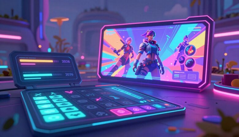
The digital world of play is changing fast. It’s moving beyond just pretty pictures on a screen. The visual landscape is now a core part of the player experience.
A big cultural and tech shift is happening. AI and spatial computing are here. People have less patience than ever. This forces designers to rethink every menu and interaction.
Modern design isn’t about decoration anymore. It’s about building smart systems. These systems must be clear and adapt to you. They must deeply respect your time and focus.
The shifts I’m talking about move us from old, static menus. We’re heading toward lively, intelligent layouts. These new elements feel like they’re working with you, not just talking at you.
This guide comes from my look at industry movements. I’ve watched developer panels and studied new releases. I’ve pinpointed the five changes defining the player’s digital environment this year.
These trends answer an overcrowded market. App stores are full of AI-made content. A product’s visual identity is now a critical signal of its quality and unique brand personality.
By the end, you’ll get more than a list. You’ll understand why these changes are emerging now. You’ll see how they’re reshaping how we interact with digital worlds.
Key Takeaways
- The player’s journey is now central to every screen and menu.
- New tools and tech are forcing a complete redesign of interactions.
- Clarity and respect for attention are top priorities in modern design.
- Interfaces are evolving into dynamic systems that assist the user.
- These movements are a direct response to a flooded marketplace.
- A strong visual identity acts as a key signal of a product’s quality.
- Understanding the “why” is crucial in this new era of digital experience.
Introduction: The New Rules of the Game Interface
We’re living in an era where the cost of creating digital experiences has plummeted to nearly zero. This has led to a parabolic surge in app store submissions. The result is a massive noise problem.
Players now have a billion options. They decide in seconds if your product is worth their time. This is the brutal attention economy.
Industry data shows progression loops are “compressed.” People expect value almost immediately. Their patience is thinner than ever.
The old rules focused on relief and basic usability. For years, designers aimed for clean, grayscale templates. That way of thinking is obsolete.
Modern interfaces must do two things at once. They need crystal design clarity. They also need bold, unique personality.
The flood of AI-assisted content creation is a key driver. When anyone can make something functional, functionality isn’t enough. Your system must signal authenticity and quality from the first glance.
It needs to be a “strange attractor” in a sea of sameness.
Recent developer panels highlight this double squeeze. There’s more competition from algorithmically generated products. At the same time, users demand instant gratification.
This context sets the stage for everything that follows. The design movements we’ll explore are direct answers to this pressure.
Interfaces can no longer be static menus. They must become hyper-contextual. They need to adapt intelligently to the player’s flow.
Every element must be crafted with a distinct point of view.
The goal has evolved. It’s not just about reducing friction anymore. The new objective is to build control and partnership.
We build trust through every pixel and animation. The experience must feel like a conversation, not a command.
For example, smart design now considers the player’s emotional state and skill level. It remembers past choices. It anticipates needs without being intrusive.
The visuals and interactions work together to create a seamless way forward.
I believe the new rule is simple. A game’s interface must be an intelligent, responsive system. Most importantly, it must remember it’s built for a human player, not just a user.
This human-centric design philosophy is the foundation for all the coming changes. It reshapes how we interact with every screen and menu.
1. AI as a Context-Aware Copilot, Not an Autopilot
Imagine an assistant that doesn’t take the wheel but instead points out the best turns on the map—that’s the new AI paradigm. For years, automated helpers tried to do everything for the user. This often led to frustration. Players felt robbed of control and discovery.
Today, the smartest design approach treats AI as a context-aware partner. It observes your behavior and intent. Then, it offers timely suggestions without interrupting your flow. This shift is a major movement in interactive design trends.
Look at Google Gemini’s recipe assistant for a clear example. It sits in a side panel. It proposes ingredient swaps without changing your original content. You can ignore it with one touch. This reactive, dismissible model is the blueprint.

In digital worlds, this way of thinking is no longer optional. Studios that ignore it risk their product feeling outdated. The stigma around AI assistance has faded, much like online dating once did. It’s now a must-use tool for creating compelling experience.
The Shift from Automation to Partnership
The old autopilot model assumed the system knew best. It would solve puzzles for you or guide you on rails. This removed the core thing people love: agency. Modern designers see AI differently.
It’s a partnership built on mutual respect. The AI analyzes the context of your play. It understands your skill level and current goal. Then, it provides support that feels like a hint from a friend.
This respects the player’s intelligence. It turns the interface from a bossy instructor into a knowledgeable ally. The language of assistance changes from “I’ll do it” to “Here’s an option if you’re stuck.”
Gaming Examples: Dynamic Help Systems and Adaptive Tutorials
Let’s make this concrete. Imagine a tutorial that adapts to your playstyle in real-time. If you struggle with a jump three times, a subtle cue appears. It doesn’t stop the action. It just highlights the ledge with a gentle glow.
Or picture a strategy game where an AI copilot analyzes the battlefield. It might suggest a flanking route in a small text log. You can choose to follow it or ignore it. The main screen stays clear for your commands.
These are dynamic help system. They avoid the front-loaded info dump that users often skip. Instead, help arrives at the exact moment of need. This compresses the learning curve dramatically.
It directly addresses modern impatience. Players want to feel powerful quickly, not lost for hours. A smart interface delivers that feeling. It turns frustration into empowerment.
Gaming UI Trends 2026: Respecting Player Agency and Flow
The key trend here is profound respect for the player’s journey. Every AI-driven element must protect agency. The helper should feel like a squadmate making a suggestion, not a director forcing a solution.
This demands careful design choices. AI interface panels should be collapsible and optional. Their visual style should be secondary to the game world. They must never hijack the primary view.
The best implementations are almost invisible. A whisper in your headset. A brief icon pulse on the edge of your screen. These subtle cues preserve immersion. They assist without breaking the magical flow state.
In this case, the personality of the AI matters too. Is it cheerful? Is it serious? Its tone should match the game’s world. This builds trust and makes the partnership feel authentic.
I believe this trend defines the next era. We are moving beyond clunky automation. We are building intelligent, respectful partnerships. The experience becomes a conversation between the player and a world that thoughtfully responds.
2. Purposeful Motion and Believable Feedback
The era of flashy, distracting animations is over. Today’s most effective interfaces use movement with clear intent. Every swipe, click, and hover must serve a function beyond looking cool.
This movement is a core part of the player’s experience. It tells a story about the state of the system. A good animation confirms an action. A great one makes you feel its weight.

I see this as a major shift in design philosophy. We’re moving from decoration to communication. The goal is to build trust through every pixel in motion.
Beyond Decorative Flair: Motion with a Job
Forget the spinning logos and unnecessary page transitions. Purposeful motion has a job to do. It guides the player’s eye to important elements.
Think of a subtle glow that pulses near a quest objective. Or a health bar that shakes when damage is taken. These trends are about clarity.
They teach mechanics without a single word of text. This is crucial in our fast-paced world. Players need to understand the result of their actions instantly.
Google’s Material Expressive language champions this idea. It makes interfaces feel “alive” and tactile. The same principle applies perfectly to interactive experiences.
Motion should respond to user behavior in a believable way. A button doesn’t just change color. It depresses like a real physical thing.
The Psychology of Delay: Making Actions Feel Consequential
Speed is usually king. But sometimes, a little wait is powerful. Product designer Emil Kowalski highlighted this insight.
He found that artificially delaying critical actions can boost user confidence. The time spent processing makes the result feel more reliable.
For critical actions, perceived reliability beats raw speed.
Apply this to a digital world. Imagine confirming the craft of a legendary item. An instant success pop-up feels cheap.
A brief, intentional delay with a forging animation builds anticipation. It makes the achievement feel earned. This builds player trust in the product.
It’s a careful balance. You must respect the player’s attention. But for high-stakes moments, weight matters more than raw speed.
Microinteractions that Delight and Inform
These are the tiny moments that create huge personality. Dan Saffer defined microinteractions. They have four distinct parts.
They are the satisfying “click” when you equip gear. The unique vibration pattern when a specific enemy is near. These small details deliver tons of information.
They also make the experience feel polished and responsive. A well-designed microinteraction turns a routine task into a small pleasure.
Here’s a breakdown of how these parts work together in a common case:
| Component | Purpose | Real-World Example |
|---|---|---|
| Trigger | Initiates the interaction (user action or system rule). | Player pulls down on a leaderboard to refresh it. |
| Rules | Defines what happens during the interaction. | The list animates downward, a loading icon spins, new data loads. |
| Feedback | Communicates the rules to the user in real-time. | The screen bounces slightly, a “whoosh” sound plays, icon changes. |
| Loops & Modes | Determines the interaction’s duration and potential changes. | If the network fails, the icon shows an “X” and the list snaps back. |
This framework is a blueprint for thoughtful design. It ensures every small interaction is meaningful.
Inclusivity is also key here. A “Reduce Motion” option is not just a nice feature. It’s a critical accessibility setting.
It allows players to control animation intensity. This prevents discomfort for some users. It respects different needs and preferences.
Great motion design serves all players. It guides, informs, and delights without ever getting in the way. That’s the true mark of a modern interface.
3. Raw, Functional Aesthetics and Neo-Brutalist Expression
Sometimes, the most powerful statement is a refusal to decorate. We’re seeing a bold pushback against overly polished, friendly interfaces. This movement embraces raw function as its core aesthetic.
I call this the “blueprint” philosophy. It values schematic clarity above all else. The goal is to make systems transparent to the users.
Look at fintech products like Crezco for a clear example. They use visible grid lines and ledger-style typography. Their layouts look like architectural plans.
This isn’t a mistake. It’s a deliberate design choice. It reduces cognitive load by showing data relationships instantly.
The “Blueprint” Look: Clarity Over Decoration
For years, many designs aimed for a soft, approachable feel. This often meant hiding complexity behind friendly visuals. The new approach does the opposite.
It exposes the structure. Think of in-game menus that resemble tactical diagrams. Inventory screens might use monospaced fonts and hard borders.
Every element serves a direct informational purpose. There’s no decorative fluff. This way of thinking is perfect for complex strategy titles.
Players need to parse information quickly. A schematic interface makes that possible. It turns the menu into a functional tool, not just a pretty screen.
Gaming UI Trends 2026: Breaking Rules with Personality
This is where neo-brutalism enters the conversation. It takes raw function and adds rebellious personality. The website for Gumroad is a famous case study.
It uses oversized typography and high-contrast color. It breaks layout rules with expressive intent. The result feels bold and memorable.
Applying this to interactive designs creates a unique identity. A gritty survival game could use a scratched, typewriter-font UI. A cyberpunk title might employ holographic wireframes.
This trend is a reaction to visual saturation. When every product looks similar, breaking rules makes you stand out. It signals confidence and authenticity.
When “Ugly” is Intentional and Effective
Let’s be clear. This isn’t about being lazy or unskilled. What some people might call “ugly” is often deeply intentional. It’s a rejection of homogenized beauty standards.
The aesthetic serves the experience. In a dense simulator, a stark, tech-looking HUD reduces distraction. It lets players focus on the game world itself.
This approach builds trust through honesty. The interface isn’t trying to disguise itself. It presents the game’s systems transparently.
Consider the difference between two aesthetic philosophies in this table:
| Aspect | Traditional “Friendly” UI | Raw Functional / Neo-Brutalist UI |
|---|---|---|
| Primary Goal | Comfort and approachability | Clarity and information density |
| Visual Style | Soft edges, gradients, pastels | Hard lines, high contrast, monospace |
| Typography | Rounded, readable sans-serifs | Bold, oversized, or technical fonts |
| Metaphor | A friendly guide | A precise blueprint or dashboard |
| Best For | Casual, narrative-driven experiences | Complex simulators, strategy games, gritty tones |
This style is a powerful tool for signaling tone. It tells the player what kind of experience to expect before they click a single thing. It cuts through the noise of crowded app stores.
Many SaaS dashboards became visually identical over time. The same happened with certain genres of interactive apps. This raw aesthetic is the antidote.
It offers a way to be brazenly functional and stylistically distinct. The best designers know that “ugly” can be beautiful when it serves the user’s needs perfectly. It’s all about the right design for the right context.
I believe this movement is about respect. It respects the player’s intelligence by not hiding the gears. It builds a partnership based on transparent text and clear elements. That honesty is the foundation of a great player experience.
4. Hyper-Personalized and Adaptive Player Experiences
True personalization in digital systems has moved far beyond just remembering your name. It’s now about the entire interface reshaping itself in real-time to match how you think and play.
This year, the most forward-thinking design philosophy treats every player as unique. Static layouts are becoming a relic. In their place, we see dynamic, intelligent systems.
These interfaces observe your behavior, learn your preferences, and adapt on the fly. The goal is to reduce mental clutter. It surfaces only the most relevant choices and information for you, right now.
This isn’t a minor tweak. It’s a fundamental shift in how we build digital experiences. The product becomes a custom-fit tool, not a one-size-fits-all jacket.
AI-Driven Layout and Content Adaptation
Think about how Netflix suggests shows. Now, apply that logic to every menu in an interactive world. Your most-used abilities float to the top of the skill bar. The map highlights objectives that align with your playstyle.
Are you a completionist? The system might subtly emphasize collectibles. If you’re a speedrunner, it could prioritize critical path markers. This design trend uses AI to curate your view.
It actively fights interface bloat. By hiding less relevant elements, it creates a cleaner, more focused flow. The player gains a greater sense of control without extra effort.
For example, a strategy game could reorganize its build menu based on your favorite units. This kind of adaptation happens quietly in the background. The result feels intuitive, as if the design was made just for you.
Adapting to Player Skill and Context
Personalization also means respecting a player’s skill level. A newcomer might see a simplified HUD with large, clear icons. An expert player gets detailed stat breakdowns and advanced tactical readouts.
The design scales complexity to match understanding. This prevents overwhelm for new users while satisfying veterans. It’s a key part of modern accessibility.
Beyond skill, context is king. We’re seeing the rise of multimodal interfaces. These tools switch between touch, voice, and gesture based on your situation.
Imagine a scenario where your hands are busy. A voice command could pull up an inventory screen. This flexibility makes the experience feel more natural and responsive to real-world conditions.
The Progression Compression Imperative
Players today have zero patience for grind. This has created a non-negotiable mandate: progression compression. Reward loops must be fast and satisfying.
Titles like ARC Raiders exemplify this. They squeeze the time between action and achievement to near-zero. The interface must facilitate this immediacy.
You might craft a powerful item after your very first battle. The visual feedback for this needs to be clear and gratifying. Menus must be streamlined to remove any friction from the reward cycle.
This compression respects the player’s valuable time. It delivers a feeling of constant accomplishment. The trend is a direct response to our crowded attention economy.
Here’s how static and adaptive approaches differ across key dimensions:
| Aspect | Static Interface | Adaptive Interface |
|---|---|---|
| Layout Logic | Fixed, designed for the “average” user. | Dynamic, rearranges based on individual behavior. |
| Information Density | Often consistent, can overwhelm newcomers. | Scales complexity based on player skill and preference. |
| Learning Curve | Steeper; player must learn the system’s fixed structure. | Flatter; the system conforms to the player’s natural flow. |
| Player Feeling | Using a standard tool. | Wearing a custom-tailored suit. |
| Progression Pace | Often follows traditional, slower reward schedules. | Actively enables and accelerates compressed reward loops. |
This hyper-personalized way of thinking is the ultimate form of respect for the player. It signals that the product is listening. The challenge for designers is immense.
They must make these adaptations feel seamless. Changes should be intuitive, not jarring. When done right, the interface itself fades into the background.
All that remains is a pure, personalized experience. It feels like the digital world was built for you, and you alone. That’s the powerful promise of this major design trend.
5. Spatial Design and the Evolving Game Canvas
The final frontier for interface innovation isn’t on a flat monitor; it’s in the space all around us. This movement is about dissolving the last hard boundary. It’s where menus and data become part of the world you’re exploring.
I see this as the most immersive design shift yet. It turns passive screens into active environments. Your health isn’t a bar in the corner. It’s a glowing sigil on your character’s wrist.
This isn’t science fiction. Hardware like Apple Vision Pro and Valve’s Steam Frame are making it real. They treat your entire field of view as a canvas. This changes everything about how we think about interfaces.
Beyond the Screen: UI in 3D Game Worlds
For years, we’ve accepted that HUDs live on the glass. Spatial design says no. Information should exist where it’s most relevant. An enemy’s health bar floats over its head in the world.
Your inventory might appear as a holographic projection you can walk around. This is called diegetic design. The interface elements exist within the game’s reality.
The result is a profound boost to immersion. You’re not pulled out of the experience to check a menu. The data is right there, integrated into the scene.
This demands a complete rethink of information hierarchy. Text and icons must be legible at many depths and angles. Valve’s Steam Frame offers a key lesson.
Its monochrome passthrough environment favors high-contrast elements. This ensures readability in a busy 3D space. It’s a practical example of form following function.
Learning from VR/AR: Windows in Space
Apple Vision Pro popularized the idea of “windows in space.” These are floating panels you can arrange around you. The Steam Frame takes this further with a hybrid model.
It blends VR immersion with familiar 2D apps. Its gaze-aware streaming is a game-changer. The system adapts content based on where you’re looking.
This enables complex, multi-tasking setups. You could have a live map floating to your left. A character stats sheet might be pinned to your right. It feels like a futuristic command center.
For designers, the lesson is about context. Spatial interfaces must be aware of the player’s focus and position. They should feel like natural extensions of the environment.
This technology is filtering into traditional screen-based experiences too. We see more games using in-world terminals and holograms. The trend is clear: the canvas is expanding.
The Challenge of Focus in a Noisy World
Putting UI everywhere creates a new problem: visual noise. In a rich 3D world, how do you highlight critical info without causing overload? The intent must be surgical.
Advanced tools are emerging to manage this. Depth-aware blur can softly defocus background clutter. Gaze-tracking allows elements to highlight only when you look at them.
This is crucial for accessibility. Some people can get overwhelmed by too much spatial data. Smart designs give players control over this density.
Consider the difference between traditional and spatial approaches:
| Aspect | Traditional Screen UI | Spatial World UI |
|---|---|---|
| Canvas | Confined to the 2D screen rectangle. | The entire 3D environment around the player. |
| Immersion | Can break the “fourth wall.” | Integrates UI diegetically into the game reality. |
| Readability Challenge | Consistent distance and angle. | Variable depth, perspective, and lighting. |
| Player Focus | Directed by screen position. | Managed by gaze, depth, and contextual highlighting. |
| Information Density | Often static and fixed. | Dynamic, can adapt to player attention and needs. |
The core challenge is balancing clarity with immersion. A health bar in the world must be seen instantly. Yet it shouldn’t look like a glaring sticker pasted on the scene.
The language of these elements must match the game’s brand and tone. A sci-fi hologram fits one product. A magical parchment scroll fits another.
I believe this movement represents the ultimate way to build partnership. The interface becomes an intelligent layer woven into the environment. It provides context without ever becoming an obstruction.
It’s the final step in making interaction feel natural. The boundary between player and system simply fades away. That’s the powerful promise of spatial design.
Conclusion: Building Interfaces for the Human Player
What ties these diverse approaches together is a renewed focus on the person behind the screen. The overarching philosophy is clear. We must build intelligent, adaptive systems that never forget their human purpose.
This is the culmination of a major shift. We’ve moved from cold automation to true partnership. We’ve swapped generic decoration for purposeful communication with real intent.
The winning design masterfully balances crystal clarity with bold character. It uses tools like AI and motion not as gimmicks, but to deeply respect player agency and flow. Every piece of content and visual language serves this goal.
In an era of overwhelming saturation, a product’s interface is a primary signal of its quality. It’s no longer just a functional shell. It’s a core part of the artistic and experiential statement.
The ultimate goal is to create designs that feel thoughtfully crafted, not automatically prompted. They should be responsive, not merely reactive. This fosters a deeper, more satisfying connection for the user.
For designers and players alike, we’re entering an exciting chapter. The experience is becoming a seamless conversation. The text, visuals, and interactions finally work as one intelligent extension of the play itself, always remembering the human at the center.
FAQ
How is artificial intelligence changing the way I interact with a game’s interface?
Why is animation and feedback in modern designs so important?
What does "functional aesthetics" or a "raw" look mean for my user experience?
Can an interface really adapt to my personal skill level and preferences?
How is the move towards 3D and spatial worlds affecting on-screen design?

Dr. Alistair Vance is a specialist in Human-Computer Interaction (HCI) with over 15 years of experience bridging the gap between functional software and immersive gaming environments. As the lead architect behind Skinning Toolkit, he focuses on psychological ergonomics and aesthetic modularity, helping developers craft interfaces that feel as good as they look.