
Hey there! If you’re like me, you’ve noticed a huge shift in how people use their screens. A popular setting that reduces glare and feels easier on the eyes has taken over apps and websites. I’m genuinely excited to talk about creating more comfortable digital experiences for everyone.
This trend isn’t actually new. It goes way back to the early days of computers with monochrome displays. The concept has evolved beautifully into a modern staple.
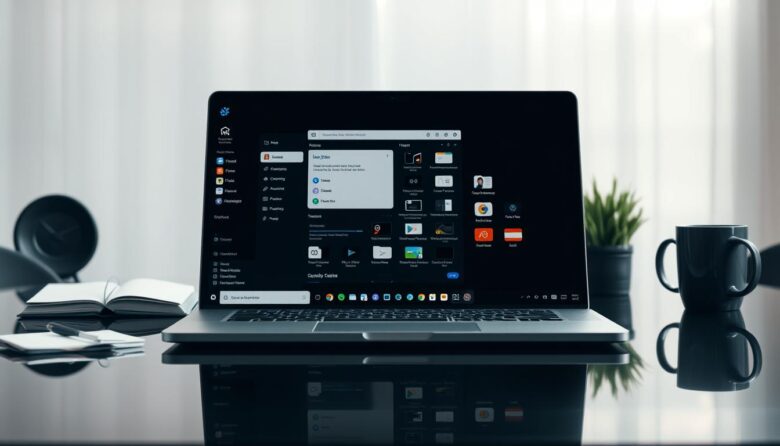
So, what is it really? It’s a thoughtfully crafted interface where light text and elements sit on a deep background. It’s far more than a simple color inversion. It’s a deliberate choice.
Here’s the thing: while this theme is wildly popular, many of us make common, avoidable errors. I’ve certainly stumbled into a few myself when starting out.
Getting this right is crucial. It directly impacts user comfort, accessibility, and even device battery life. That’s why I’m writing this guide.
My goal is to walk you through these pitfalls with a friendly, conversational tone. I’ll share lessons from my own journey. By the end, you’ll have actionable strategies to implement this look intentionally.
And remember, a core best practice I always follow is giving people a choice. Letting them switch between a light and a dark theme is fundamental to good experience.
Key Takeaways
- This popular visual setting has deep roots in computing history.
- Successful implementation requires careful planning, not just swapping colors.
- Common mistakes can hurt readability and overall user comfort.
- Doing it right improves accessibility and can reduce eye strain.
- Always offer users a choice between light and dark themes.
- Proper contrast and color selection are non-negotiable for quality.
- This guide provides clear, actionable steps to sidestep frequent errors.
Why Getting Dark Mode UI Design Right Matters
Beyond its sleek appearance, implementing a dark theme correctly serves some very real, practical purposes. It’s a functional feature that changes how people interact with an interface.
I see it as a tool for comfort, not just a style. Getting it wrong can frustrate your audience. Getting it right builds trust.
The primary benefit is reducing eye strain. In low-light conditions, a bright screen can feel harsh and overwhelming.
A darker interface emits less light. This creates a softer viewing experience for tired eyes, especially at night.
It also cuts down on glare. I remember checking my phone in a pitch-black room and being blinded by the standard bright look. Switching to a dark theme was an instant relief.
This visual setting can enhance accessibility, too. For folks with visual impairments or sensitivity to light, it can make screens usable where they weren’t before.
But it’s not a universal solution. Some individuals read text better on a light background. That’s why offering a choice is so crucial.
On modern smartphones with OLED displays, there’s a bonus perk: battery saving. True black pixels are turned off, using no power.
This can extend your device’s life between charges. It’s a smart efficiency win.
Of course, a dark interface isn’t perfect for every situation. In bright sunlight, a light mode is often more readable.
This balanced view is key. We’re not saying one is better than the other. We’re saying both have their place.
Because of these varied impacts, crafting this theme well is a responsibility we have as designers. Our choices affect real people’s daily experience.
A well-executed dark theme contributes directly to a positive, comfortable, and inclusive user journey. It shows you care about their comfort.
Here are the core reasons to prioritize it:
- Reduces eye fatigue in dim environments.
- Minimizes screen glare for a more pleasant view.
- Supports accessibility for many users.
- Can save battery life on OLED screens.
When you treat it as a core part of the experience, not just a color swap, you build better products. Your users will feel the difference.
Mistake 1: Using Pure Black and Stark White
When I first began experimenting with dark interfaces, my biggest misconception was equating them with a simple color swap. I thought, “Just flip the background to black and the text to white, and you’re done!” It seemed logical, but it created a surprisingly harsh experience.
This approach is the most frequent error I see. It misunderstands the core goal of comfort. Let’s break down why it’s a problem and what to do instead.
The Eye-Strain Effect of Maximum Contrast
Using pure white (#FFFFFF) on a pure black (#000000) background creates excessive contrast. This is often called “maximum contrast.” While it might sound good for readability, it has the opposite effect over time.
Your eyes have to work incredibly hard to adjust between these extremes. The bright white text can appear to vibrate or glow against the deep void of the black background. This effect is sometimes called “halation.”
It leads to rapid eye fatigue and headaches, especially in low-light settings. The goal is to reduce strain, not cause it.
My Go-To Alternatives: Dark Grays and Off-Whites
Instead of pure extremes, I use deep, dark grays as my foundation. For the main background, I love colors like #121212 or #1A1A1A. They are very dark but have a slight tonal warmth.
For primary text, I switch from stark white to off-whites or light grays. A color like #E0E0E0 or #F5F5F5 is much softer on the eyes. It maintains excellent readability without the harsh glare.
This choice impacts all other elements. Buttons and icons need to stand out against this slightly lighter canvas. Using these tones creates a cohesive, gentle palette.
Major platforms use this strategy. YouTube’s dark theme uses #181818. Figma’s is #1E1E1E. Slack uses #1D1D1D. Notice none are pure black.
A quick tip: test these colors in your design tool or browser developer tools. Toggle between pure black and a dark gray like #121212. You’ll immediately feel the visual difference.
| Aspect | The Problem (Pure) | The Solution (Recommended) | Hex Code Example | Effect on Eyes |
|---|---|---|---|---|
| Background Color | Pure Black (#000000) | Dark Gray | #121212, #181818 | Reduces harshness, provides depth |
| Primary Text Color | Stark White (#FFFFFF) | Off-White / Light Gray | #E0E0E0, #F5F5F5 | Soften glow, improves long-term reading |
| Overall Contrast | Maximum, often jarring | High, but balanced | N/A | Minimizes eye strain and vibration |
| Example Platform | Basic color inversion | Professional dark mode design | YouTube (#181818 BG) | Creates a comfortable, modern interface |
Avoiding pure black and white is the first, most fundamental step. It shifts your work from a simple color flip to an intentional, comfortable design. Your users will thank you for the thoughtful contrast.
Mistake 2: Ignoring Accessibility and Contrast Guidelines
A common oversight in implementing a dark look is neglecting established accessibility guidelines. It’s easy to assume that if something looks okay to you, it’s good for everyone. That assumption can create real barriers.
For many people, accessibility is the difference between using your product and abandoning it. In a low-light interface, contrast is its cornerstone. It directly affects folks with low vision or color deficiencies.
Treating this as optional is a major error. It’s a fundamental part of respectful, inclusive design.
Why Your Text Might Be Failing WCAG Standards
The Web Content Accessibility Guidelines (WCAG) set the global standard. They provide clear, measurable goals for contrast. For normal body text, the minimum ratio is 4.5:1.
Large text, like headings over 18pt, needs a 3:1 ratio. What does 4.5:1 mean? It’s a math formula comparing the luminance of your foreground and background colors.
In simple terms, it measures how much your text pops from its background. A higher number means better visibility.
Here’s the big pitfall. Many assume light color on a dark one always has good contrast. Often, the shades are too similar. A medium gray on a dark gray background fails miserably.
This creates a muddy, hard-to-read interface. It defeats the whole purpose of a comfortable viewing experience.
How I Use Contrast Checker Tools in My Workflow
I make checking a non-negotiable habit. For every color pair I define, I run it through a tool. My go-to is the WebAIM Contrast Checker.
My workflow is simple. I plug in my hex codes for the foreground and background. The tool instantly gives me a pass/fail rating against WCAG standards.
If it fails, I adjust the lightness of my text color until it passes. I never just guess.
Let me give you an example. Say my background is #1A1A1A (a dark gray). I pick a medium gray for text, like #888888.
The checker shows this combo has a ratio of about 3.5:1. It fails for normal text. To fix it, I lighten the text to a #CCCCCC. Now the ratio jumps to a passing 7.5:1.
This principle applies everywhere. It’s not just for paragraphs. Buttons, form fields, and icons need sufficient contrast, too.
Another layer is respecting system settings. Some users enable increased contrast on their devices. Our design should adapt gracefully to that preference.
| Element Type | Failing Color Combo (Example) | Contrast Ratio | Passing Color Combo (Fix) | Contrast Ratio | WCAG Status |
|---|---|---|---|---|---|
| Body Text | #888888 on #1A1A1A | 3.5:1 | #CCCCCC on #1A1A1A | 7.5:1 | Pass (AA) |
| Large Text / Heading | #AAAAAA on #121212 | 4.1:1 | #E0E0E0 on #121212 | 9.2:1 | Pass (AAA) |
| Button Background | #333333 on #121212 | 2.1:1 | #444444 on #121212 | 3.1:1 | Pass (Large UI) |
| Border/Icon | #555555 on #1E1E1E | 2.8:1 | #777777 on #1E1E1E | 4.3:1 | Pass (AA) |
Make this verification a core part of your process. Don’t save it for the final validation step. Check contrast early and often.
It ensures your dark theme is not only stylish but genuinely usable for all. That’s the hallmark of great digital design.
Mistake 3: Forgetting to Desaturate Your Colors
Imagine your brand’s vibrant signature color suddenly feeling like a glaring spotlight in a dim room. That’s the shock many users face when a bright palette is slapped onto a deep background. It’s a common oversight I’ve made myself.
This mistake breaks the comfort we aim to create. It turns a soothing theme into a visually stressful experience. The fix isn’t about dulling your brand’s personality.
It’s about adapting its intensity for a new environment. Let’s explore why saturation matters and how to adjust it gracefully.
How Oversaturated Colors Become Jarring on Dark Backgrounds
Highly saturated colors, like a bright pink (#FF007F), emit intense light. Against a dark canvas, they lack a bright white background to balance them. This creates a harsh, vibrating effect.
Your eyes struggle to process the extreme difference. The color can appear to bleed or glow unnaturally. It feels like a neon sign in a quiet, dark space.
This visual noise causes fatigue quickly. It distracts from the content and hierarchy of your elements. The goal is harmony, not shock.
Material design guidelines recommend toned-down colors here. The reason is legibility and reduced eye strain. A desaturated hue is easier to look at for long periods.
Desaturation means reducing the purity or intensity of a color. It adds a touch of gray, making the hue feel softer and more sophisticated. This simple shift makes all the difference.
A Simple Method for Toning Down Your Brand Palette
You don’t need to abandon your brand colors. Just create a dedicated version for low-light themes. My method is straightforward and systematic.
Start with your primary brand color from your light mode palette. Open a color picker in any design tool. Reduce the saturation value by 20-40%.
Sometimes, I also slightly adjust the lightness. The result is a muted, elegant version of the original. It retains its identity without overwhelming the senses.
Let me give you a concrete example. A bright, saturated blue like #007BFF is common for links. Its desaturated, dark mode-friendly counterpart could be #357ABD.
See the difference? The second blue is still clearly blue. It’s just calmer and more comfortable against dark grays.
I suggest building a separate color palette token in your system. Label it clearly for your dark theme. Define primary, secondary, and accent colors there.
| Light Mode Color | Hex Code | Dark Mode Adjusted Color | Hex Code | Change Made |
|---|---|---|---|---|
| Vibrant Pink | #FF007F | Muted Pink | #D96B8A | Reduced Saturation |
| Bright Blue | #007BFF | Subdued Blue | #357ABD | Reduced Saturation & Slightly Darkened |
| Energetic Green | #00CC66 | Soft Green | #5CA67A | Significantly Desaturated |
This doesn’t mean your interface becomes dull. It gains sophistication and reduces visual fatigue. Always test your new colors in context.
Apply them to buttons, icons, and alerts. Ensure they still convey the right meaning and importance. This proactive step ensures a cohesive and comfortable experience for everyone.
Mistake 4: Applying Light-Mode Shadows to Dark-Mode Elements
Have you ever spent hours crafting the perfect drop shadow, only to watch it disappear when the screen turns dark? I’ve felt that frustration deeply. It’s a common error to copy shadow styles directly from a bright palette.
This mistake flattens your entire layout. Visual elements lose their separation and hierarchy. The sense of depth you worked so hard to create simply vanishes.
Shadows that define buttons and cards in light mode often become invisible. They fail to translate to a low-light environment. Let’s explore why this happens and what to do instead.
Why Shadows Disappear and Depth Vanishes
The physics of light is key here. A dark shadow on a dark background lacks contrast. Our eyes need that difference to perceive elevation.
In a bright scheme, a shadow is a visible, darker area. It creates the illusion of depth. On a deep canvas, that same shadow blends right in.
It offers no visual cue. The result is a flat, muddy interface. Clickable elements don’t look interactive anymore.
This harms user experience. People rely on visual hints to navigate. Without them, your design feels confusing and unpolished.
My Preferred Techniques: Highlights, Glows, and Gradients
I abandoned relying on traditional shadows for low-light themes. My toolkit now focuses on light-based effects. Subtle borders, inner glows, and gentle gradients work wonders.
For a raised button, I use a faint outer glow. Pick a color complementing the element. A soft blue or neutral gray often works well.
Apply it with low opacity, around 30%. Add a generous blur effect. This creates a delicate halo that implies elevation without harshness.
A thin, light border on the top edge simulates a highlight. It mimics how light would catch a physical object. This technique is excellent for cards and containers.
Ultra-subtle gradients can differentiate surfaces. Use a slightly lighter shade at the top of an element. Gradually transition to a darker shade at the bottom.
This creates a layered effect against the main canvas. It maintains visual hierarchy beautifully. The goal is to make key elements look actionable and distinct.
These methods preserve the comfort of a dark theme. They add necessary depth without introducing visual noise. Your layout stays clean and intuitive.
| Technique | Best For | How to Implement | Visual Effect | Example Use Case |
|---|---|---|---|---|
| Outer Glow | Buttons, Floating Actions | Low-opacity color, high blur radius, spread of 0-5px | Creates a soft, elevated halo | Primary call-to-action button |
| Highlight Border | Cards, Containers | 1px solid light gray on top/side edge only | Simulates a raised edge catching light | Profile card or content panel |
| Subtle Gradient | Background Surfaces | Vertical gradient from #1E1E1E to #252525 | Adds gentle depth and material separation | Navigation bar or sidebar |
| Inner Glow | Input Fields, Active States | Very light color inset with a small blur | Suggests an inner light source or focus | Text input on focus |
Shifting from shadows to these light-based techniques transformed my work. The before-and-after difference is striking. Elements regain their definition and purpose.
This approach is a cornerstone of thoughtful design for different themes. It ensures your interface remains functional and attractive. Always test these effects in the final dark mode environment.
Your users will appreciate the clear, comfortable hierarchy. It turns a potential mistake into a polished, professional feature.
Mistake 5: Neglecting Typography and Readability
One of the most subtle yet impactful mistakes involves how we treat fonts and spacing. In a low-light theme, every typographic choice is magnified. It directly shapes legibility and comfort.
I’ve seen beautiful layouts fail because the text became hard to parse. This isn’t just about aesthetics. It’s about creating a pleasurable reading experience.
When readability suffers, user engagement drops. People will leave if they have to squint. Let’s fix that.
The Problem with Thin Font Weights in Dark Mode
Thin or light font weights are a major culprit. They appear faint and ghostly on deep backgrounds. The letters seem to glow or disappear.
This visual effect forces your eye to work harder. It can lead to strain and headaches over time. That defeats the whole purpose of a comfortable setting.
I learned this the hard way with a favorite thin font. It looked elegant in my bright layout. In dark mode, it was a blurry mess.
The solution is straightforward. Use regular or medium weights for body copy. Reserve bold weights for headings and emphasis.
This provides the necessary visual heft. Characters stand out clearly against the background. Your content remains easy to scan.

Optimizing Text Color, Size, and Spacing for Clarity
Color choice is just as critical. Pure white text can be glaring. I recommend off-white or light gray shades instead.
Colors like #E8E8E8 or #F0F0F0 offer excellent contrast. They are soft on the eyes without sacrificing clarity. Always test your combinations.
Size and spacing need adjustments too. Slightly increasing font size can help. A 1px bump often makes a big difference.
Line-height is your best friend. I aim for a value between 1.5 and 1.8. This gives each line breathing room.
Letter-spacing can also improve legibility. A tiny increase, like 0.5px, helps separate characters. It reduces visual crowding.
Context matters. Text on cards or modals may need further tweaks. Ensure contrast holds on all surfaces.
My personal checklist keeps me on track. I review these five aspects for every project.
| Typography Aspect | Common Mistake | My Recommendation | Why It Works |
|---|---|---|---|
| Font Weight | Using thin, light fonts | Regular or Medium for body | Prevents faint, glowing text; improves character definition |
| Text Color | Pure white (#FFFFFF) | Off-white/Light Gray (#E8E8E8) | Reduces glare while maintaining high contrast |
| Font Size | Same size as light theme | Consider a slight increase (e.g., +1px) | Compensates for how we perceive type on dark surfaces |
| Line-Height | Tight, cramped spacing | 1.5 to 1.8 (or 150% to 180%) | Improves scanning and reduces line confusion |
| Letter-Spacing | Default tracking | Minor increase (e.g., 0.5px) | Enhances character separation for better clarity |
This systematic approach transforms typography. It turns a functional dark mode into a delightful one.
Remember, people read on all kinds of screens. A phone in bed, a tablet on the couch, a monitor in a dim office. Your design must work everywhere.
Thoughtful typography is the final touch. It shows you care about the reader’s comfort from the first word to the last.
Mistake 6: Not Giving Users a Choice (The No-Toggle Trap)
There’s a fundamental principle in digital design that’s often overlooked: giving people control over their visual environment. Forcing a single theme on everyone is a major user experience misstep. I hold a strong opinion on this.
Preference depends on so many factors. The ambient lighting, the time of day, and even individual vision sensitivity all play a role. A look that’s perfect at noon can strain your eyes at midnight.
Locking someone into a single scheme ignores their reality. It says, “My way is the only way.” That’s not how we build trust or comfort.
This mistake creates what I call the “No-Toggle Trap.” The user is stuck with no escape. For content-heavy sites, this isn’t just inconvenient. It’s a barrier to accessibility.
Respecting User Preference and System Settings
The smartest starting point is to respect the system-level setting. Modern operating systems let people choose a preferred color scheme globally.
We can detect this via the prefers-color-scheme CSS media query. Using it as a default shows you respect the user’s broader device setup. It’s a sensible and polite baseline.
A design that adapts to the user’s environment is a design that cares.
But the system setting isn’t always perfect for your specific app or website. That’s why a manual override is non-negotiable.
Always provide an easy-to-find toggle within your interface. This puts the final choice firmly in the viewer’s hands. It transforms a rigid scheme into a personalized experience.
Designing an Intuitive Theme Switcher: Examples I Love
A great switcher is intuitive and provides clear feedback. I admire designs that make the action obvious. Placement is key—usually in the header or settings menu.
MDN Web Docs uses a thoughtful dropdown. It offers three options: Light mode, Dark theme, and a brilliant “OS Default.” This last option defers to the system preference, offering the best of both worlds.
WAKU uses a minimalist sun/moon icon toggle. It’s clean and has a smooth transition. A tooltip clarifies the action, which is helpful for new visitors.
Both examples store the selection. Persisting the user’s choice across sessions is a technical must. It creates a consistent, personalized feel every time they return.
Here are the core principles I follow for any theme switcher:
- Intuitive: The control’s function should be immediately understandable.
- Clear Feedback: The active state must be visually distinct.
- Consistent Location: Place it where users expect to find settings.
- Persistent: Remember the selection for future visits.
Testing is crucial. Check the toggle on every page and in every state. Ensure the transition between light mode and dark theme is seamless. No flashes or broken layouts.
| Switcher Type | Best For | Example | Key Advantage | Consideration |
|---|---|---|---|---|
| Icon Toggle (Sun/Moon) | Minimalist interfaces, mobile apps | WAKU, many mobile apps | Saves space, visually clean | May need a tooltip for clarity |
| Dropdown Menu | Content-heavy sites, developer docs | MDN Web Docs | Explicit labels, includes “OS Default” | Takes up slightly more UI real estate |
| Toggle Switch with Labels | Web apps, settings panels | Many web dashboards | Very clear binary choice | Can feel less elegant than an icon |
| System-Only (No Manual Toggle) | Not recommended as sole option | N/A | Respects OS setting | Fails to offer user control for site-specific preference |
Ultimately, offering a choice is a sign of respect. It acknowledges that people use dark and light modes for different reasons. Their needs change.
Your colors in dark theme might be perfect, but the user might simply prefer the other look today. Giving them that power is the hallmark of thoughtful, user-centric design.
Mistake 7: Using a Flat, Single-Color Background
Picture an interface where every single component melts into a shadowy void. It becomes impossible to tell where one element ends and another begins. This is the direct result of a flat, single-color dark background.
It turns a potentially sleek layout into a confusing, hard-to-scan mess. The visual hierarchy you built simply collapses. Let’s explore why this happens and how to build a structured canvas.
How Lack of Depth Creates a Muddy Interface
When everything sits on the same black background, separation disappears. Cards, sidebars, and buttons all blend together. This creates what I call a “muddy” look.
Your eyes have no anchor points to navigate. There’s no sense of depth or layering. Important elements don’t stand out, which hurts the overall user experience.
Scannability takes a huge hit. People can’t quickly group related information. The whole interface feels flat and uninviting, the opposite of comfortable.
Implementing Color Surface Variants for Hierarchy
The solution is beautifully simple. Use subtly different shades of dark gray to create “surface variants.” Think of them as elevation levels for your colors.
Each shade defines a distinct layer in your layout. This technique builds depth through tonal shifts, not harsh lines. It guides the viewer’s eye naturally.
Spotify’s approach is a masterclass. They use a layered palette to organize their entire app. The main canvas is #000000.
Content panels and cards sit on a #121212 surface. Navigation bars and active states use #1F1F1F. This three-shade system creates clear, comfortable grouping.
You can establish your own system. Start with your base dark color, like #121212. Lighten it in small steps of 8-10% to create variants.
I recommend defining three or four levels. Too many variants look noisy. The differences should be subtle but noticeable.
This tonal layering mimics the effect shadows provide in a bright theme. It brings structure and order to your low-light interface.
| Surface Level | Purpose & Use Case | Example Hex Code | Visual Effect |
|---|---|---|---|
| Base Background | The deepest canvas; the foundation for everything. | #000000, #0A0A0A | Sets the overall tone and deepest point of depth. |
| Primary Surface | Cards, main content panels, modal backgrounds. | #121212, #1A1A1A | Lifts content slightly, creating the main readable area. |
| Secondary Surface | Navigation bars, sidebars, sticky headers. | #1F1F1F, #242424 | Defines persistent navigation and secondary groupings. |
| Tertiary Surface | Active states, selected items, input field backgrounds. | #2D2D2D, #333333 | Provides clear interactive feedback and focus states. |
Apply these surface colors to your components with intention. A card uses the Primary Surface. A sidebar uses the Secondary Surface.
An active input field can pop with a Tertiary Surface. This instantly tells the viewer what’s interactive and what’s grouped.
The key is contrast between layers. Ensure your text remains readable on each surface. Always test your palette in context.
Moving from a flat background to a layered one transforms the design. It adds sophistication and clarity without any visual noise.
Your user will feel the difference immediately. The interface becomes intuitive and easy to navigate, even in a low-light setting.
Mistake 8: Overlooking Icon and Image Visibility
Icons and pictures can become invisible against a deep backdrop if we’re not careful. This is a subtle error that undermines the entire interface. It happens when we assume graphics will translate perfectly from a bright scheme.
Those visual elements are crucial for navigation. When they fade, the user experience suffers. People rely on them to understand actions and content.
Fixing this isn’t about making everything glow. It’s about ensuring critical signals remain clear. Let’s explore why assets blend in and how to solve it.
When Assets Blend Into the Dark Background
Icons designed for light backgrounds often lose definition. Their fine details and colors get swallowed by the dark canvas. What was once a clear symbol becomes a vague shape.
The same goes for images, especially those with white edges. They can appear to float without context. This creates a disjointed and confusing layout.
The problem is a lack of contrast. Without it, visual hierarchy collapses. Important graphical cues become hard to spot at a glance.
My Fixes: Strategic Borders, Color Adjustments, and Asset Optimization
My first-line solution is adding a thin, contrasting border. A white or light gray stroke around a colored icon makes it “pop.” This preserves the original color while ensuring separation.
For a more systematic approach, consider two asset sets. Create slightly lightened variants of your icons for low-light use. This maintains brand consistency while optimizing for visibility.
Handle photographs and illustrations with care. Ensure they have their own container or a subtle backdrop. This prevents them from merging with the main background.
Let me give you a concrete example. A blue “download” icon might vanish on a navy surface. Adding a 1px white stroke instantly solves the problem. The icon remains recognizable and actionable.
This isn’t about making everything bright white. It’s about ensuring critical UI signals are clear. Auditing all graphical assets during the design phase is a must.
Don’t assume they’ll work. Test each one in the final dark theme environment. Your users depend on these visual cues for intuitive navigation.
| Asset Type | Common Issue | Recommended Fix | Implementation Example |
|---|---|---|---|
| Detailed Icons | Fine lines disappear; colors blend in. | Add a subtle contrasting stroke/border (1px, #FFFFFF at 30% opacity). | Navigation menu icons, action buttons. |
| Brand Colored Icons | Brand color lacks contrast against dark gray. | Use a pre-lightened variant from a dedicated dark mode asset set. | Social media icons, primary call-to-action symbols. |
| Images with White Backgrounds | Harsh edges create visual “holes” in the layout. | Place image in a card with a subtle surface color (e.g., #1E1E1E). | Product photos, blog post featured images. |
| Small UI Indicators | Notification dots or status icons become invisible. | Increase size slightly and use a high-contrast, saturated color. | Unread message indicators, active status lights. |
These adjustments ensure your graphical elements serve their purpose. They guide users through your interface effortlessly.
Remember, a comfortable screen experience relies on clarity. Every icon and image should feel intentional. This attention to detail separates good design from great.
Treat this as a non-negotiable step in your process. The result is a polished, professional look that works in any lighting condition. Your users will appreciate the thoughtful execution.
Mistake 9: Failing to Test in Real-World Conditions
I’ve learned a hard lesson: a visual scheme that shines in a dim, controlled environment can completely fall apart under the sun. It’s easy to get cozy in my studio and assume my work is perfect. The real world, with its unpredictable lighting and myriad of devices, is the ultimate test.
The Perils of Designing in a Controlled Bubble
Creating in a quiet, dim room is a trap I’ve fallen into. You tweak colors and elements until everything looks just right on your calibrated monitor. It’s tempting to think that’s how it will look for everyone, everywhere.
This assumption is dangerous. What appears as a deep, rich black on your screen might look washed out on another. The technology behind the display makes a huge difference.
OLED and LCD screens render blacks differently. On OLED, true black pixels are off, saving power and creating infinite contrast. On an LCD, black is just a very dark gray, glowing from the backlight.
Your beautiful, battery-saving dark mode might not have the same visual punch on all devices. Testing on actual hardware is non-negotiable.
My Testing Checklist: Different Devices, Lighting, and Times of Day
I now follow a strict, real-world checklist. It moves my work from the bubble into the hands of actual people. Here’s the framework I use to ensure consistency and comfort.
| Test Scenario | Device / Screen Type | Lighting Condition | What I Look For |
|---|---|---|---|
| Direct Sun Readability | Smartphone (OLED & LCD models) | Outdoors, bright sunlight | Can I read text without max brightness? Do elements have enough contrast? |
| Ambient Room Light | Tablet or Laptop | Indoor, balanced room light | Does the interface feel comfortable, or is it too dim? Is the background too stark? |
| Low-Light / Nighttime | Desktop monitor | Dark room (post-sunset) | Is there any harsh glare or eye strain? Do bright accents feel jarring? |
| Extended Reading Comfort | Preferred e-reader device | Various times of day | Can I read a long article (5+ min read) without fatigue? This is my “5-minute read” test. |
Testing at different times of day is crucial. Our pupils dilate in low light, changing how we perceive contrast. A scheme that’s gentle at noon might feel flat and hard to read at midnight.
I always swap placeholder text for real content blocks. Specific font weights and color combinations can fail with actual copy. Lorem ipsum won’t reveal those issues.
Most importantly, I involve people with different visual abilities. Their feedback on accessibility and comfort is invaluable. It turns my assumptions into real user experience data.
Rigorous, contextual testing is the only path to a theme you can ship with true confidence. It transforms a good design into a reliable, comfortable experience for every screen and setting.
Mistake 10: Treating Dark Mode as an Afterthought
Many of the errors we’ve discussed share a single, preventable origin: treating the low-light theme as a final step. It’s the classic “we’ll add it later” mindset. This approach guarantees a disjointed, frustrating visual experience.
When you bolt on a look as a feature, it shows. Colors clash, components break, and the whole interface feels unpolished. The solution is to treat both visual schemes as core to your planning from day one.
The Pitfalls of a Simple Color Inversion
Applying a basic CSS filter or inverting hex codes is a tempting shortcut. It feels like a one-click solution. The result, however, is often visual chaos.
Bright brand colors become neon hazards. Images with white backgrounds create glaring holes. Subtle shadows and borders vanish completely.
I once saw a dashboard where a simple invert turned a friendly yellow button into a harsh, dark purple. It lost all its call-to-action energy. The data visualization charts became impossible to read.
This method ignores context and meaning. It treats your careful color palette as meaningless numbers. The outcome is a broken, uncomfortable experience that users will quickly abandon.
How to Integrate Dark Mode UI Design from the Start
The professional path is “parallel theme” thinking. You consider both light and dark schemes during the initial phase. This is a cornerstone of modern systems like Material Design.
Start by defining semantic color tokens. These are names like --surface-background or --text-primary. They describe an element’s purpose, not its specific hue.
“Define a semantic color system that adapts to different themes. This separates meaning from appearance, creating a flexible foundation.” – Material Design Guidelines
In your light theme, --surface-background might be #FFFFFF. In your dark theme, it becomes #121212. The component using this token doesn’t need to change. It automatically adapts.
Set up your design tool for this workflow from the start. In Figma, use styles and variables. Create a page where you design components side-by-side in both themes.
This side-by-side workflow ensures consistency. You instantly see if a button is readable or if a card has enough separation in both contexts. It prevents surprises late in the process.
| Aspect | Reactive Approach (Afterthought) | Proactive Approach (Integrated from Start) |
|---|---|---|
| Foundation | Hard-coded hex values scattered in CSS. | Semantic tokens in a central design system. |
| Workflow | Design light theme first, then hack a dark version. | Design components in both themes simultaneously. |
| Color Palette | One set of colors, often breaking when inverted. | Two coordinated palettes defined for intent and contrast. |
| Outcome | Fragmented, inconsistent user experience. | Cohesive, polished product across all contexts. |
| Team Efficiency | Massive rework and bug-fixing later. | Saves time and reduces technical debt significantly. |
This proactive method saves immense time. It turns theme switching from a costly retrofit into a natural outcome of your system. The quality of the final product leaps forward.
Encourage your team to adopt this mindset. It’s the hallmark of a mature, user-centric process. You’re not just designing a screen; you’re crafting a comfortable experience for every condition.
Your users may never know about semantic tokens. But they will feel the difference. They’ll enjoy an interface that feels intentional, consistent, and respectful of their choice, no matter the time of day.
Conclusion: Designing Dark Mode with Intention
The journey through these common pitfalls reveals a core truth: intentionality separates good from great. It’s about making thoughtful choices for user comfort and clarity, not just applying a different color scheme.
Remember the key lessons. Use deep grays instead of pure black. Ensure proper contrast for accessibility. Desaturate bright colors. Create depth with layers, not shadows. Optimize your typography. Most importantly, always offer a choice between visual themes.
This approach transforms a simple feature into a premium experience. It shows respect for your audience’s context and needs. View this not as a constraint, but as an exciting chance to enhance your skills.
Start small. Audit one project against these mistakes. Test in real conditions and iterate. With this mindset, designers can create interfaces that are both beautiful and profoundly user-friendly. I’d love to hear about your challenges and successes!
FAQ
Why shouldn’t I use pure black for my app’s background?
How do I know if my text has enough contrast?
My brand colors look too bright in the theme. What should I do?
How can I create depth without traditional shadows?
What’s the best way to make text easy to read?
Is a theme toggle really necessary?
My interface looks flat and muddy. How can I fix it?
How do I stop my icons from disappearing?
What’s the most important real-world test I should run?
When should I start thinking about this during a project?

Dr. Alistair Vance is a specialist in Human-Computer Interaction (HCI) with over 15 years of experience bridging the gap between functional software and immersive gaming environments. As the lead architect behind Skinning Toolkit, he focuses on psychological ergonomics and aesthetic modularity, helping developers craft interfaces that feel as good as they look.
